Black Friday is a bloodbath for media buyers. Every November, the internet turns into an endless wall of high-contrast banners screaming about massive discounts. Cost-per-acquisition spikes, extreme ad fatigue sets in within hours, and consumers simply tune out the noise.
Throwing a massive budget at standard "Buy Now" creatives is a guaranteed way to destroy Q4 margins. When every single competitor is bidding on the exact same audience with the exact same aggressive discount, the only actual leverage left is the creative itself.
Winning the Black Friday auction requires bypassing standard banner blindness entirely. It demands formats that do not look like traditional ads, or frameworks that tap into deep psychological triggers before the logical brain registers a sales pitch. Standard countdown timers are no longer enough.
Here is a breakdown of the most effective creative frameworks and interactive formats designed to cut through the November chaos, complete with the psychology behind why they work.
The "Comfort Nostalgia" Framework
Millennials aged 30 to 45 are exhausted. They are navigating constant economic uncertainty, widespread professional burnout, and an incredibly toxic daily news cycle. For this specific demographic, childhood has become a psychological safe space.
Instead of engaging with stressful new trends, this audience retreats. They put 90s and 2000s cartoons on repeat. They watch the same holiday movies every year. They consume content that recreates their old bedrooms and favorite childhood toys simply to slow down and feel safe again.
This creative concept capitalizes directly on that deep need for comfort.
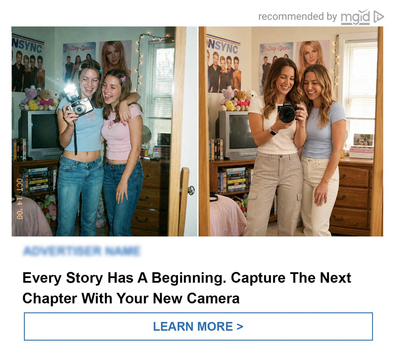
Instead of a loud, aggressive sales pitch, the creative recreates the distinct look and feel of a bygone era. Think warm, slightly faded color grading. Familiar retro interiors. Vintage objects and the exact ambient sounds everyone remembers from 1999.
The advertised product does not interrupt this memory; it blends perfectly into it. It is positioned seamlessly as an item that brings back that exact same sense of stability and ease.
- The core message: A brief, comforting return to a time when everything simply made sense.
- Best used for: Verticals where emotion and trust drive the final purchase decision. This framework is highly effective for e-commerce, consumer goods, home and comfort products, and entertainment.
The "Blur Teaser" Format
Human psychology dictates that people are inherently wired to finish incomplete pictures.
When a highly recognizable product is hidden behind a heavy blur, a black censorship bar, or a tight crop showing only a fragment - like a specific texture or silhouette - it forces the user to pause. The brain immediately wants to solve the visual puzzle.

A hidden product makes the audience stop scrolling, guess the item, and actively return for the grand reveal. This format is incredibly effective as a strategic warm-up campaign right before a major Black Friday sale or product launch.
It builds genuine anticipation in the days leading up to the event. When the final creative drops with the fully revealed product and the active discount, it meets an audience that is already primed and waiting for it.
The "Notes App List" Anti-Design
Standard polished ads trigger immediate banner blindness. Consumers see a high-production graphic and scroll past it on autopilot.
The "Notes App" framework uses anti-design to break that habit. The creative is stylized to look exactly like a raw smartphone screenshot of the native Notes app - an ordinary, everyday to-do or shopping list.
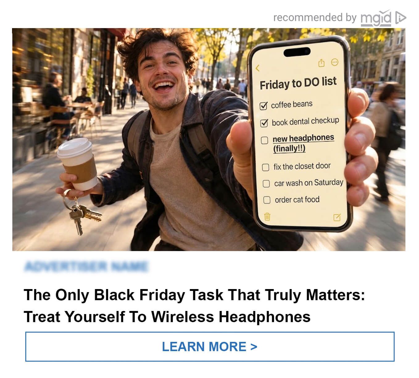
Among totally mundane daily tasks like “buy milk,” “call mom,” or “book dentist,” one single line stands out in bold text. That bold line is the advertised product.
This format feels deeply personal and entirely native to a mobile environment, almost as if a friend accidentally shared a personal screen. Because it lacks all the visual markers of a traditional corporate advertisement, the brain processes the information before defensive ad-blindness kicks in. The bold text elevates the product from a generic sales pitch to an absolute must-have among basic daily routines.
Commanding Attention Through Rich Media
Static banners simply fade into the background. During Black Friday, consumers scroll through feeds on complete autopilot. Halting that momentum requires advertising to stop functioning as a flat image and start operating as an interactive experience. Rich Media formats force users to physically engage with the creative before their defensive ad-blindness mechanism even activates.
Consider these three interactive mechanics designed to hijack user attention.
The Interactive Parallax (Countdown)
At first glance, this looks like a standard creative featuring a hero product and a countdown timer. The actual mechanic is hidden in the interaction. When a cursor moves across the screen, the central elements - the model and the headphones - smoothly track the direction of the mouse.
This parallax effect shatters the visual wall between the content and the viewer. Users pause simply to test how the animation works. In that brief window, their attention locks directly onto the timer and the core product. Visual contact is established, and the promotional message is delivered without applying aggressive pressure.
In-Banner Customization (Black+Neon)
Forcing a user to click through to a landing page just to view different color options burns conversions on unnecessary friction. This format transforms the ad block itself into a miniature storefront.
The viewer sees a product flanked by intuitive white interface arrows. Clicking those arrows changes the sneaker color directly inside the creative. This is a micro-conversion. The consumer has not even visited the store yet, but they have already invested time customizing the product to their liking. Any subsequent click-through carries massive intent because the purchase decision is already partially formed.
The Hover-Reveal (High-Impact Directional Typography)
Throwing aggressive typography at an overwhelmed audience from the second one often triggers an immediate bounce. This format relies on a much sharper psychological trigger. Initially, the creative displays only a clean visual subject without any heavy text clutter.
The moment the cursor crosses the ad threshold, massive phrases and giant discount figures instantly snap onto the screen. This mechanic runs on pure curiosity. The user performs a physical action and receives an immediate visual reward. The sales offer does not scream at the viewer immediately; it appears as a direct response to their own interaction, drastically lowering ad fatigue.
The Creative Advantage
Winning Black Friday auctions no longer depends solely on having the largest ad budget. When cost-per-acquisition peaks and audiences suffer from severe ad fatigue, the only true differentiator left is the creative experience itself. Bypassing standard banner blindness requires formats that tap into user psychology - whether through nostalgic comfort, strategic curiosity, or frictionless interactive design.
Leveraging a digital advertising platform like MGID provides the native environments and high-impact formats necessary to execute these exact strategies seamlessly. The campaigns that dominate Q4 will not be the ones that shout the loudest with generic discount banners, but the ones that finally break the pattern and engage consumers on a deeper, interactive level.