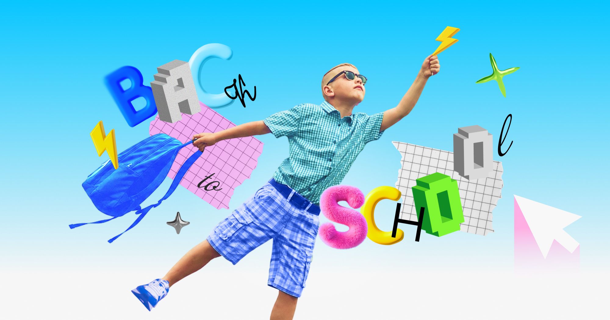
The traditional Back to School advertising playbook is completely broken. Every August, brands roll out the exact same predictable visual clichés: bright yellow school buses, perfectly ironed clothes and a smiling student holding a pristine notebook.
What happens with all that perfection? Gen Z scrolls right passed it. They have grown up swiping past targeted ads, so if a creative looks like a corporate photoshoot, they don't even process the text.
Winning the BTS season right now requires a totally different visual language. You have to abandon the polished studio look and start mirroring the actual digital and emotional environment of your audience. If you want to stop burning your ad spend this August, tear down your existing BTS templates and build your campaigns around these four raw, native design trends.
Oversized, "Puffy" Typography
Minimalist, clean corporate fonts do not always work for this demographic. Right now, the dominant text style is oversized, puffy typography.
This popular font style is everywhere in Gen Z’s world. It covers their laptop stickers, their water bottles and their stationery. When you use puffy, bubble-style lettering, it feels familiar and aligns with their own personal aesthetic, rather than a standard commercial graphic. It bridges the gap between traditional advertising and user-generated content.
How to visualize it in campaigns: Think about interactive Rich Media ads.
- Concept A: An ad for imaginary wireless headphones. The background is a bright, contrasting color. The text uses massive, puffy 3D letters dominating the screen, bouncing slightly as the user scrolls, looking exactly like a digital sticker pack.
- Concept B: A campaign for an energy drink or study snack. Bold, neon-colored puffy typography literally overlaps the product, crowding the frame the way teenagers crowd their laptop lids with decals.
The Scrapbook Aesthetic (Visual Density)
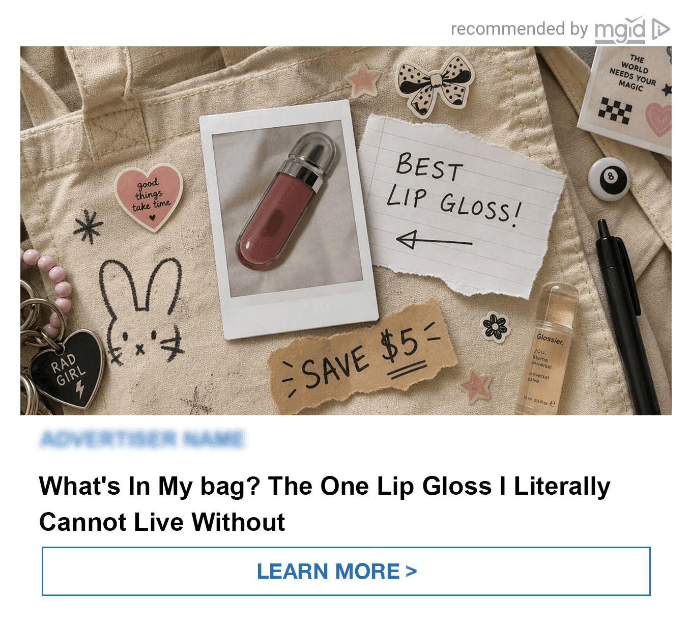
Stop relying on one clean product photo sitting in the middle of a white background. The current aesthetic demands visual density. You need to layer three or four different elements into a single frame to create a scrapbook effect. Combine a slightly grainy polaroid-style product shot with a handwritten-font caption. Layer a torn-paper sticker graphic over the corner to show the price or discount. Draw a messy, digital doodle arrow pointing to the product. This chaotic layering transforms a standard product showcase into something that feels deeply personal and native to the feed.
How to visualize it in campaigns: Imagine a static ad built around the "what's in my bag" concept. We look down at an open canvas tote bag or a crossbody purse. Inside, the design uses the scrapbook approach: a polaroid-style photo of an imaginary product, mixed with familiar everyday shapes. There are no hard brand logos visible — the advertiser's name on the polaroid is slightly blurred. It looks like a digital mood board, not a sales pitch.
The Ironic "End of an Era"
Nostalgia is shifting. This generation doesn't wait ten years to feel nostalgic; they experience it pre-emptively. They miss summer while it is still happening.
The phrase "end of an era" has become a massive running joke. Gen Z will apply it to something totally mundane, like a random Tuesday beach trip. It is deliberately over-dramatic. Everyone posting it knows it is a joke, and the audience knows it is a joke.
Your creatives need to lean into that, wrapping genuine emotion in a layer of self-parody. If your ad tries to play the "end of summer" angle with sincere, heavy melodrama, it instantly stops feeling native. It can easily come across as forced. You have to make it look like you aren't taking the concept too seriously.
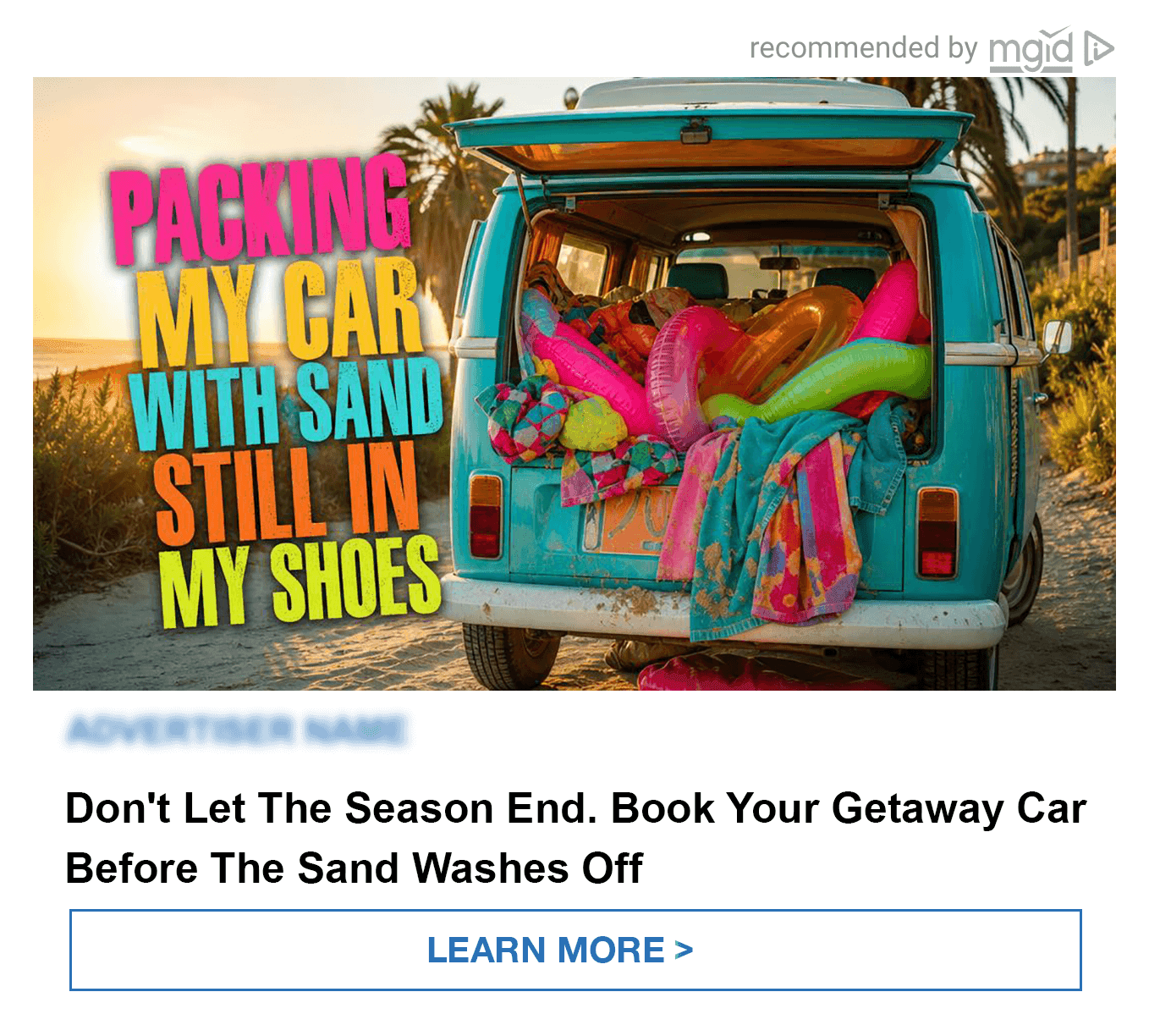
How to visualize it in campaigns: Think of an ad for a car rental service. The visual is a slightly blurry, golden-hour shot of a beach, representing the last road trip of the season. The headline reads: "Packing my car with sand still in my shoes" or "Last sunset before dorm room windows." It captures that real-time, exaggerated grief of a summer ending, using irony to secure the click.
Real Chaos: The Death of the Flatlay
90-degree angles, symmetrical spacing and flawless ring lighting are in the past. Audiences have adapted. They can spot a perfectly styled flatlay as a paid ad within half a second, triggering immediate banner blindness. Instead of a polished grid, you need to show real, unstyled moments.
Show the actual environment. Things scattered across a bedroom floor before a big move. A half-finished packing list with crossed-out items. A suitcase that won't close. When you show reality, it builds trust and mirrors the user’s actual emotional state. Also, showing the chaos removes the pressure to have a perfect aesthetic and signals to the viewer: "This is normal, everyone's room looks exactly like this."
The product shouldn't even be the main focus. It needs to be placed naturally among everyday items.
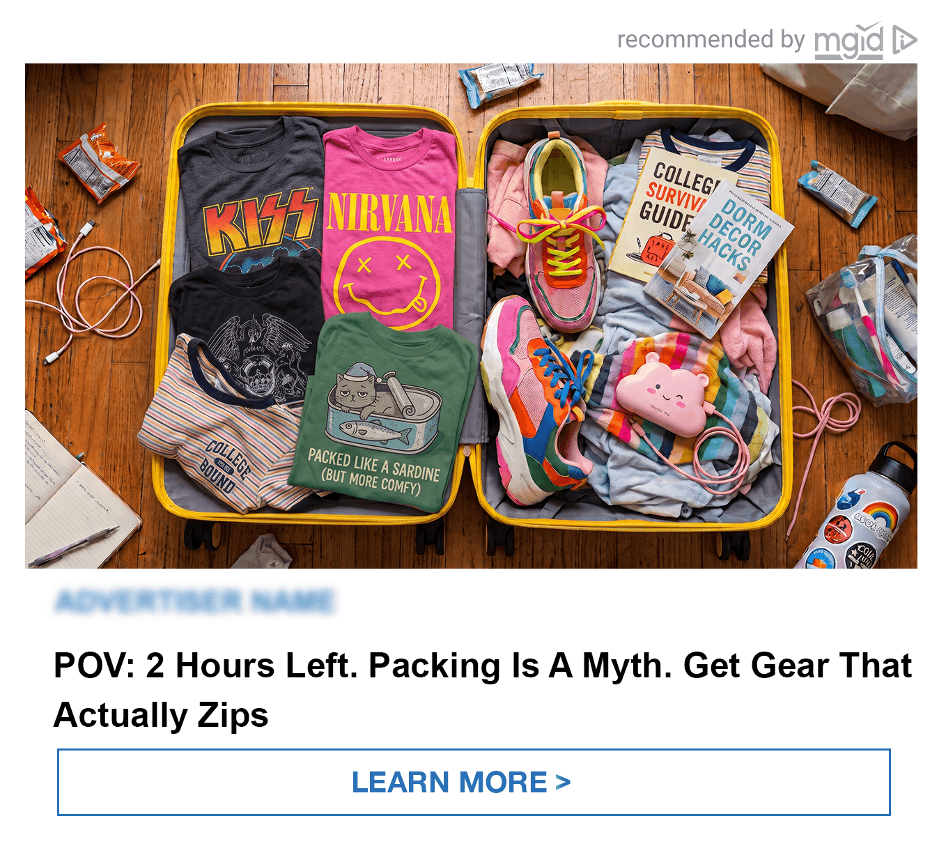
How to visualize it in campaigns: A static ad featuring an imaginary luggage brand. The headline simply says: "POV: 2 hours before I leave for college." The camera looks straight down into a half-open suitcase or a cardboard moving box. Clothes and random items are thrown in at odd, frustrating angles. The product itself (the suitcase) is just part of the mess. Right next to it sits a half-drunk iced coffee and a forgotten phone charger. The ad captures the reality of an honest, stressful moment.
The Bottom Line: Stop Selling, Start Matching the Vibe
Back-to-school season is a stressful, chaotic, and highly emotional transition for your audience. And your ads should reflect that. If you keep serving them overly polished creatives of shiny red apples and pristine desks, you might miss the mark this Q3.
To actually connect with Gen Z this August, you have to speak their visual language. Soften the rigid brand guidelines. Lean into the irony, layer your elements like a personal scrapbook and let your products live inside their actual, everyday reality.
Your audience is smart enough to know they are seeing an ad. You don't need to disguise it. You just need to focus on authenticity rather than staged perfection. When your creatives feel like a natural part of their feed, your engagement will naturally improve.