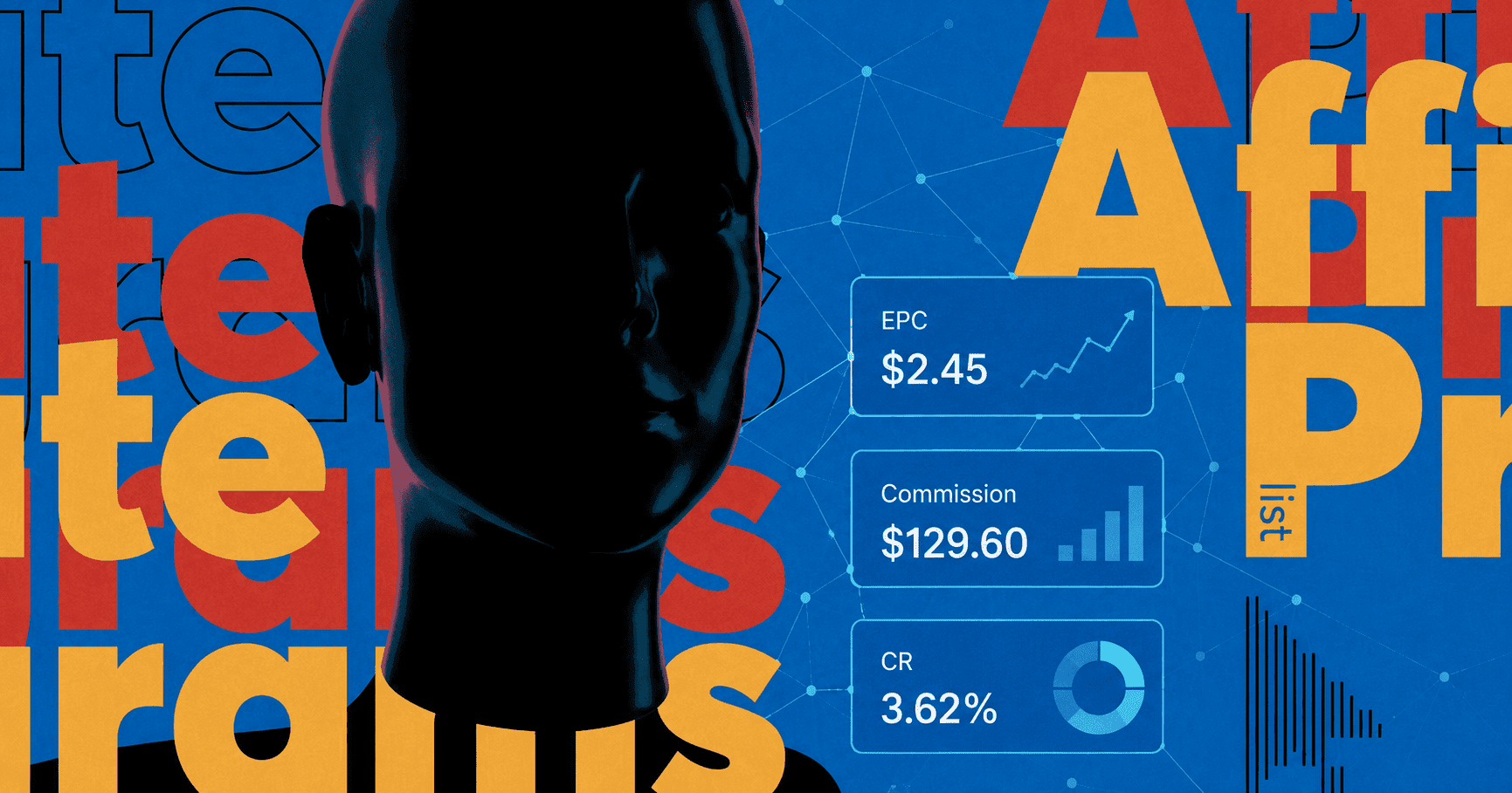
During the last century, humanity has faced the rapid development of two worlds: advertising and technology. The intersection of the two dimensions has had an immense impact on how people react to information. Sophisticated and picky, consumers across the globe demand much more than a decade ago; they want their needs, preferences, and expectations to be considered more than ever before. Advertisers do realize that push notifications are here to stay; they provide engagement, conversion, and retention.
Push messaging is a truly challenging tool, however the ends justify the means. And yet there is a fine line to think about; it takes a perfect balance between being persuasive and not looking aggressive at the same time. A successful push campaign requires a relevant, creative, and optimized pre-lander which is sure to increase the conversion rate. A proper optimization of pre-lander and implementation of persuasive elements in the push campaign together make a solid hook for the users.
Pre-lander: grabbing users’ attention
First and foremost, let's get to the essence of a pre-lander. Technically, the pre-lander is another step before conversion, it is the page that comes right before the landing page containing the offer. Pre-landers stand for convincing and predisposing the users to convert, and assuring that visitors have a clear idea of what they are in for. If landing pages provide the customer with more detailed information about the offer, prelanders, in contrast, are concise and brief (well, there might be exceptions).
Our extensive experience has shown that in the realm of prelanders brevity is the soul of wit. A quintessence of interesting and attractive information in a simple, yet catchy, wrapping is a magic wand that boosts the key indicators. Pushing landing pages is an art which is based on a number of specific laws and key components.
Must-have elements of pre-landers
The meaning of conversion varies from one industry to another. And just as well as other elements of a push campaign, pre-lander structure is defined by the industry and context. In any case, let's take a glance at the most common characteristics of effective pre-landers.
- Load speed. Capturing the attention of a user is a very important thing indeed. However, the load speed of a pre-lander is as important as with websites. Speed is about keeping the attention; no content in the world will retain the user if the pre-lander takes more than 4-5 seconds to load. When designing the page make sure it is not too heavy. The longer the pre-lander loads, the lower CR will be, as simple as that.

- Creativity. We have mentioned before that a one-size-fits-all stance is no good for push campaigns whatsoever. So using templates or stealing landing pages from your competitors simplifies things for you to a certain extent, but this approach is ineffective. It's better to create new content for every landing page. When it comes to brainstorming design, storyline, and tone of voice, one has to question oneself: how will future creatives reflect these ideas? Landing page and creatives have to be in close connection
- First screen. Let's put ourselves in the user's shoes and think about who he or she is. Maybe he is a driver stuck in a traffic jam. Or a woman waiting in line for her doctor’s appointment. These people have a lot of things to be distracted by. Thus, there are but or just a few seconds to grab their attention - which is worth millions. All the navigation buttons, call-to-actions, and service terms and conditions should be at the user’s fingertips, and this means on the very first screen.

- A sense of urgency + call to action. Driving sales is directly related to creating a sense of urgency. Writing 'just do it!' is not enough. You have to make users take an action, so there have to be time-related design elements such as calendars and countdown timers that indicate how much time is left for making a purchase. Call to action basically offers a chance to act fast and right away. Any CTA button must be placed at the webpage top to be noticed immediately. When designing a pre-lander, a call to action needs to be catchy and specific.

- Instant shopping. Subscribing to push notification is the first step, clicking on them to see new content is the second. Everything is seamless and simple. The third step which is completing the action, which should not be hidden somewhere far, far away from the first-page scroll. User-friendly experience all the way through walks hand-in-hand with conversion rates.
- Free trial. Is there anybody in the world who doesn't like getting something for free? I doubt it. Offering your visitors a free trial is an effective way of boosting leads and sales rates. In any case, it is vitally important to keep in mind the following idea: a potential visitor of a pre-lander is short of time and has plenty of things to do. Thus, even a free trial offer must be presented using a clear CTA message.

- Blog-like design. At present, bloggers appear to be one of the most reliable sources of information, they are influencers. Bloggers are trusted to a far greater extent that politicians, celebrities, journalists, or brands. This should be considered when gaining the trust of your audience; people like blogs. To this end, a pre-lander having features of a blog is more likely to engage the users and make them stay longer on the webpage.
- Video content. Fact: landing pages containing videos increase conversion rates. However, it takes enormous effort to create video content that would not make people bored within the first seconds. Video works when a user feels engaged while watching something. Everything matters: storyline, narration, musical accompaniment, animation, and all of these attributes are set to convince the user he's in the right hands. When making a video thumbnail make sure it is not just the first frame of the video, but a catchy and attractive picture.

Things to say 'no' to
- Redirects. It is an axiom: people despise redirects. You will definitely lose a customer who sees multiple website addresses via the browser address bar or flashing parts of redirected web pages — this is a path to a fiasco. Of all the annoying practices this one is probably the winner.
- Vibration pop-ups. You can actually copy the bold phrase and paste it into Google to see for yourself; people get mad at vibration pop-ups, they express their irritation and concern about them. This technique scares users. Grabbing customers’ attention with it is nothing less than aggression and irritating. When creating a push campaign, remember being gentle with people's privacy and sense of security.