The goal of any marketing funnel is to move prospects from the traffic source to the sales page and ultimately to checkout. A crucial step in this process is the bridge page — a prelander page used in affiliate marketing to qualify leads and "warm them up" to an offer before they see the final pitch.
When you infuse your affiliate campaign with a successful bridge page funnel, incoming prospects will not only be prepared for the sale — they’ll welcome it! In this article, you’ll learn exactly what a bridge page is, why you need it in your affiliate campaign and how you can design and implement one today.
Plus, you’ll see some real-life examples of our own bridge pages at MGID, which together have contributed to thousands of dollars in affiliate sales!
- What Is a Bridge Page?
- What Is a Bridge Page in Affiliate Marketing?
- Bridge Page vs. Landing Page vs. Prelander: What's the Difference?
- Types of Bridge Pages
- Real Bridge Page Examples That Convert
- Best Verticals for Bridge Pages
- How to Create a Bridge Page in 7 Steps
- MGID's Best Practices for High-Converting Prelanders
- Bridge Page FAQ
What Is a Bridge Page?
A bridge page sits between an advertisement and the final offer. Instead of sending visitors straight to a sales or product page, it gives them a chance to learn more, build trust and decide whether the offer is relevant before taking the next step.
Think about someone clicking on a native ad about improving their sleep. If they immediately land on a product page asking them to buy, many will leave because they still have questions. A bridge page fills that gap by providing useful context first, whether that's an advertorial, a product review, a quiz or a short video.
This extra step doesn't just inform potential customers. It also filters out people who aren't genuinely interested, meaning the visitors who reach the landing page are typically more engaged and more likely to convert.
For affiliate marketers, that's one of the biggest advantages of using a bridge page: it turns cold traffic into warmer, better-qualified prospects before they ever see the final offer.
What Is a Bridge Page in Affiliate Marketing?
In affiliate marketing, a bridge page helps connect advertising traffic with an affiliate offer in a way that feels natural. Rather than sending visitors directly to a sales page, it gives them the information and reassurance they need before asking them to take action.
This is especially important for native advertising, where users expect helpful, relevant content instead of an immediate sales pitch. A well-designed prelander page can introduce the product, answer common questions, highlight its benefits and build trust before visitors reach the advertiser's landing page.
The right funnel depends on the product you're promoting, your audience and your campaign goals. In most affiliate campaigns, there are three common approaches:
- Don’t use a bridge page
- Use a bridge page
- Use a bridge page with an email opt-in
Let’s examine each option in detail:
Option #1: Without Bridge Page

While bridge pages are often the best choice for affiliate campaigns, they aren't mandatory in every case. Some offers can still convert well by sending users directly from an ad to the advertiser's landing page.
This approach typically works for low-cost, impulse-driven products that require little explanation or consideration. If the offer is easy to understand and the value proposition is immediately clear, an extra step in the funnel may not be necessary.
However, skipping a bridge page also means asking visitors to make a decision with very little context. If the product is more expensive, unfamiliar or requires a higher level of trust, many users will leave before converting.
Another requirement for campaigns without bridge pages is the price should be relatively low. Generally, prospects aren’t likely to make an emotional purchase on a pricier item.
As a general rule, the more questions a potential customer is likely to have before making a purchase, the more valuable a bridge page becomes.
Option #2: With Bridge Page

This is the most common approach in affiliate marketing, and for good reason. A bridge page gives you an opportunity to answer objections, build trust and explain the value of an offer before sending visitors to the advertiser's landing page.
Instead of treating every click as a potential sale, a bridge page helps qualify your traffic. Visitors who continue to the next step are typically more engaged, better informed and more likely to convert.
Depending on your strategy, a bridge page can take many forms, including an advertorial, a product review, a quiz, a comparison page or an interactive calculator. The right format depends on your audience and the product you're promoting.
Beyond improving conversion rates, bridge pages often increase engagement and reduce bounce rates by giving visitors useful, relevant content before presenting the final offer. It's a better experience for users and a more effective funnel for affiliates.
Option #3: With Bridge Page + Email Opt-In

Adding an email opt-in takes your bridge page one step further. Before visitors reach the affiliate offer, you invite them to subscribe in exchange for something valuable, such as exclusive content, a discount, a free guide or personalized recommendations.
This extra step helps identify highly interested prospects while giving you the opportunity to build a first-party audience you can engage with beyond a single campaign.
Even if someone doesn't convert right away, they're not necessarily a lost opportunity. With an email list, you can continue the conversation, share relevant content and introduce future offers that match their interests.
For affiliates running long-term campaigns, combining a bridge page with email capture can increase both immediate conversions and customer lifetime value.
Which setup makes sense for your campaign? Answer three quick questions to see which funnel structure may be the better fit.
Bridge Page vs. Landing Page vs. Prelander: What's the Difference?
The terms bridge page, landing page and prelander are often used interchangeably, but they don't always mean the same thing. Understanding the difference helps you build a more effective affiliate marketing funnel.
| Page type | Purpose | Position in the funnel |
|---|---|---|
| Bridge page | Educates, qualifies and warms up visitors before presenting the main offer. | Between the ad and the landing page or offer. |
| Landing page | Encourages a specific action, such as making a purchase, signing up or requesting a quote. | The final destination where the conversion happens. |
| Prelander | In affiliate marketing, a prelander is typically another name for a bridge page. It often uses informational or editorial-style content to prepare users for the offer. | Between the ad and the landing page or offer. |
In practice, bridge page and prelander usually refer to the same type of page in affiliate marketing. Both are designed to build trust, answer questions and create interest before visitors reach the advertiser's landing page.
A landing page, on the other hand, has a different goal. Rather than informing visitors, it's focused on conversion, whether that's completing a purchase, submitting a form or starting a free trial.
Types of Bridge Pages
The best format depends on your audience, the product you're promoting and how much information visitors need before they're ready to convert. If you're building an article-style prelander, our guide to choosing the right prelander content format goes deeper into problem-solution articles, reviews, how-to guides, stories, explainers and more.
Here are some of the most effective bridge page formats used in affiliate marketing.
Advertorial
An advertorial bridge page combines editorial-style content with product promotion. Rather than selling directly, it tells a story, explains a problem and introduces the product as a solution. This format works particularly well for health, beauty and consumer products because it builds trust before asking visitors to take action.
Review Page
A review page helps potential customers evaluate a product by covering its features, benefits and possible drawbacks. Including comparisons, testimonials or personal experience makes the content more credible and helps visitors feel more confident before clicking through to the offer.
Quiz or Interactive Tool
Quizzes, calculators and surveys encourage visitors to actively engage with your content instead of simply reading it. They also allow you to personalize recommendations, making the final offer feel more relevant. These formats are especially popular in finance, insurance and wellness campaigns.
Video Sales Letter (VSL)
Some products are easier to explain through video than text. A Video Sales Letter (VSL) walks visitors through a problem, demonstrates the solution and builds credibility before directing them to the landing page. This format is commonly used for software, online courses and high-ticket offers.
Educational Article or Guide
Sometimes the simplest approach is the most effective. A well-written article that answers common questions, explains how something works or shares practical advice can naturally introduce an affiliate product without feeling overly promotional. This format tends to blend in seamlessly on native ad placements since it reads like content rather than a pitch.
Real Bridge Page Examples That Convert
Seeing different bridge page formats in action is one of the easiest ways to understand what makes them effective.
Below, we’ve rounded up 4 examples of high-performing bridge pages we’ve used here at MGID. All of these examples convert very well, and each has the potential to move the needle and boost sales for your own business, regardless of the product or industry.
Example 1: Advertorial — Health Supplement

Advertorials are one of the most popular — and most successful — bridge page options for affiliate campaigns. There’s a good reason why: an advertorial offers a real customer’s perspective on a product. It’s not just a review; it’s a powerful success story that conveys emotion and outlines a customer’s transformation before and after the purchase.
The below example is for a health supplement that improves vision. The speaker in the advertorial is a customer who achieved great results from using the product, and now, they’re sharing their experience. When prospects see this kind of testimonial from someone else, they’re far more likely to take action.
Advertorials are fantastic choices for bridge pages because they provide evidence of a product’s value. If you do it right, you’ll have prospects ready to place an order before they even reach the sales page.
Example 2: Online Quiz — Retirement Savings

The main benefit of using an online quiz for your bridge page is engagement. They also provide an opportunity to get to know your leads better.
When engagement is high, prospects spend more time interacting with your campaign, learning about the products and getting value from the brand. Not only will this boost conversions today but also will build long-term customer loyalty tomorrow.
The bridge page below is a great example of a well-performing online quiz for a financial service. In addition to taking the quiz, prospects are prompted to leave their email address, which salespeople can use later on to contact them with more information and additional offers.
Example 3: Calculator — Car Insurance (State & Age)

Much like an online quiz, a calculator bridge page gives customers a chance to interact and engage. They enter their information and get a free customized response, and that response can provide some insight into if the product or service is right for them.
In this example, prospects use the calculator to discover how much car insurance would cost them. It’s a simple, easy-to-use feature; all they have to do is enter their state of residence and age to receive an answer.
Example 4: Calculator — Car Insurance (Zip Code Savings)

Here’s another example of a calculator bridge page. By entering their age range and zip code, prospects can quickly see how much they can potentially save on car insurance by switching plans.
Before even reaching the main sales page, they understand the value of the product, and they know what kind of results to expect. With all this in mind, many prospects are already considering a purchase — all that’s left to do is close the deal.
See how powerful a high-quality bridge page can be?
Here’s the takeaway…
These examples of bridge pages are successful because they boost engagement, convey strong emotions, present valuable information and work to build a lasting customer relationship.
Focus on achieving these goals for your affiliate campaigns, and you’re bound to strike gold with a winning bridge page of your own.
5 Bonus Examples of Winning Bridge Pages
Looking for more ideas for your bridge page? There’s plenty of others to choose from. Here’s another 5 examples of some of our winning bridge pages.
Bonus Example 1: BetterMe — Fitness App — Article
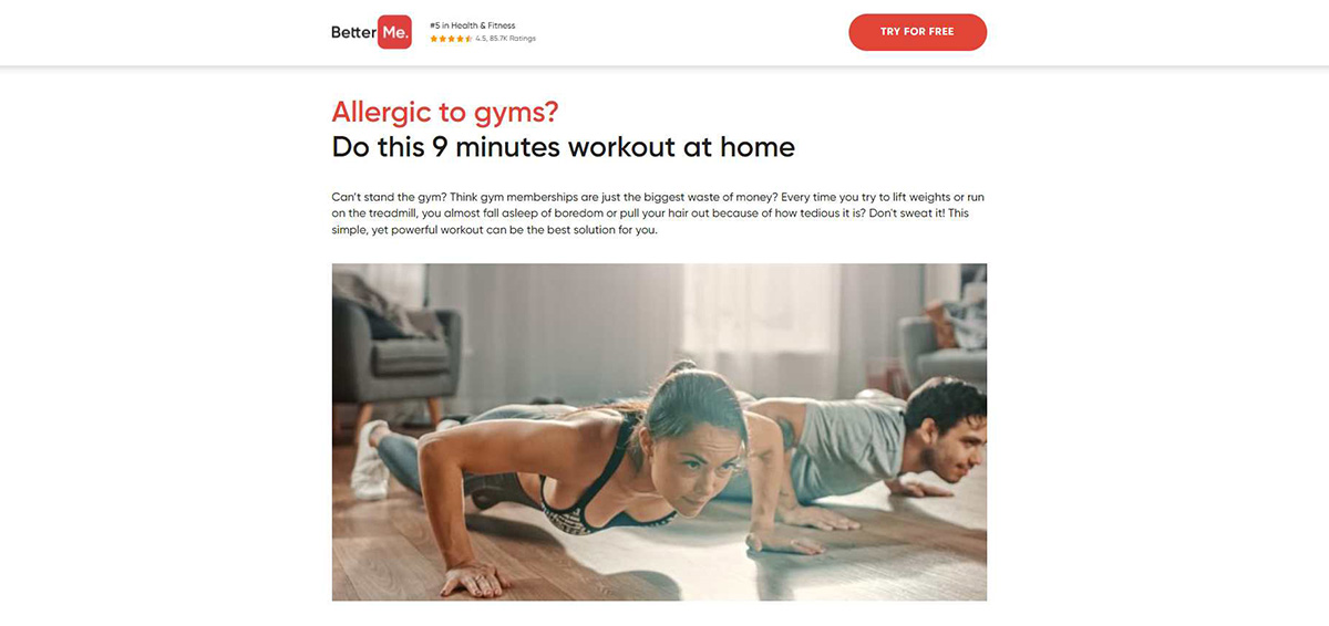
Sometimes, simplicity is best. That’s the idea behind using an article for your bridge page, which is shown in this example. The goal with an article is to provide a prospect with valuable information for free, giving them a taste of what’s to come if they buy the product on the next page. In this case, that product is a fitness app.
This article also accomplishes another goal we’ve been talking about: building a lasting relationship with the customer. When someone reads the article, they are likely to remember the brand (BetterMe) and return later for more advice. That’s how you keep a lead around for a long time!
Bonus Example 2: Kin — Home Insurance — Testimonials Page

This example shows a testimonial page, which is an informative piece featuring customer reviews and positive testimonials. There’s nothing more powerful than showing real success stories to convince new prospects to take action.
There will typically be even more testimonials on the sales page, but featuring them in the bridge page will encourage prospects to continue moving through the funnel.
In this case, they’re prompted to click and get a free quote for a home insurance plan, and the customer success stories prove that doing just that is well worth it.
Bonus Example 3: MojoHelp — Software — Chatbot Flow

It’s always effective if you can add some engaging, interactive elements into your bridge page. The chatbot flow strategy is perfect for this. The above example shows a chatbot flow for a company offering a new cashless payment method for small businesses.
Even though the chatbot’s answers are automated, it feels as though you’re having a real conversation. The flow leads to a calculator function where prospects can discover how much money they can make with the new method.
Bonus Example 4: Sleepium — Health — First-Person Article

This bridge page example uses an advertorial-style, first-person article from a customer for a sleep mask. This strategy is a lot like an advertorial, where it’s essentially a long testimonial describing the product’s benefits. Notice how this article seems very casual, relatable and easy to read. It doesn’t feel like a company sales pitch — it feels like a conversation you’d have with a friend.
In the article, the customer starts by talking about their problems with sleep, and how it was affecting their day-to-day life. Then, they dive into the solution that helped them: the sleep mask.
When a prospect reads this article, they’ll learn exactly what problems the product can solve, and how it can change their lives for the better. It’s a powerful persuasion tactic that can lead to a serious uptick in conversions for any affiliate campaign.
Bonus Example 5: Foamatic — Health — Article
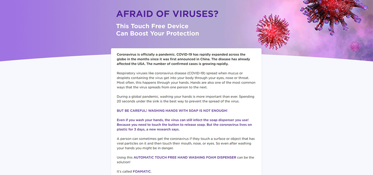
Here’s another example of an article as a bridge page for a health product. Again, this page is clear, concise and easy to read, helping prospects move through the funnel without a hitch. At the same time, it’s informative and valuable, while introducing the product and laying out the benefits.
Another note — take a look at how visual this bridge page is. Prospects don’t want to just read about a product, they want to see it in action. The article provides this with several up-close pictures of the product.
Best Verticals for Bridge Pages
While bridge pages can improve almost any affiliate campaign, they're especially effective for products and services that require more explanation or trust before users are ready to convert.
Health and Wellness
Health products often promise meaningful results, so potential customers usually want more information before making a purchase. An advertorial, customer story or expert-backed review can explain how the product works, address common concerns and build credibility before leading visitors to the offer.
Finance and Insurance
Whether it's a loan, investment platform or insurance policy, financial decisions rarely happen on impulse. Bridge pages can simplify complex topics with calculators, quizzes or comparison guides, helping users feel more confident before requesting a quote or signing up.
Software and SaaS
Software products often require visitors to understand how a tool solves their problem. A bridge page can demonstrate key features, showcase real use cases or include a short video walkthrough before directing users to a free trial or product page.
E-commerce and Consumer Products
For products that aren't yet widely recognized, a bridge page can answer questions, explain benefits and highlight customer experiences. Review pages and comparison articles are particularly effective for helping shoppers evaluate their options.
Online Courses and Digital Products
Educational products usually require a greater level of trust and commitment than physical goods. A bridge page gives creators an opportunity to demonstrate expertise, share success stories and explain what users can expect before asking them to enroll or make a purchase.
How to Create a Bridge Page in 7 Steps
If you’ve made it this far, you hopefully realize how important a bridge page is and what a successful bridge page looks like. Now, there’s only one thing left to do — build your own! Whether you call it a bridge page or a prelander, the process of building one and learning how to make a prelander that actually converts follows the same core steps.
Step 1: Know Your Audience
Before you start designing a bridge page, think about who you're speaking to. What problem are they trying to solve? What questions or concerns might stop them from clicking through to the offer? Understanding your audience will help you choose the right message, tone and content format.
Step 2: Choose the Right Bridge Page Format
Different products call for different approaches. An advertorial works well when you want to tell a story, while quizzes, calculators and comparison pages help visitors interact with your content. If your product needs a demonstration, a Video Sales Letter (VSL) may be the better choice. Choose the format that best matches both your audience's expectations and your campaign goals.
Step 3: Focus on Value Before the Sale
The best bridge pages educate first and sell second. Explain the problem, introduce the solution and provide useful information that helps visitors make an informed decision. Customer testimonials, product comparisons, expert insights and real-life examples can all help strengthen credibility.
Step 4: Include One Clear Call-to-Action
Every bridge page should guide visitors toward a single next step. Whether your goal is to send users to the advertiser's landing page or collect email sign-ups, keep your call-to-action simple, visible and easy to understand. Too many competing buttons or links can reduce conversions.
Step 5: Optimize for Mobile
A large share of affiliate and native advertising traffic comes from mobile devices. Make sure your bridge page loads quickly, uses a responsive layout and keeps text easy to read on smaller screens. A fast, mobile-friendly experience can have a significant impact on engagement and conversion rates.
Step 6: Test and Improve
Even small changes can make a noticeable difference. Experiment with different headlines, images, calls-to-action and page layouts to see what resonates with your audience. Regular A/B testing helps you identify what drives higher click-through and conversion rates.
Step 7: Use the Right Tools
You don't need to build everything from scratch. Depending on the format you've chosen, there are plenty of tools that can help:
- Blogs, articles or advertorials: WordPress or Medium.
- Landing page builders: Leadpages.
- Quizzes and surveys: Typeform or Google Forms.
- Interactive calculators: Calculoid.
If you're running campaigns with MGID, our creative team can also help with copywriting, design and bridge page development, making it easier to launch campaigns faster and optimize them for performance.
Remember, a bridge page is meant to prepare visitors for your landing page. When you answer questions, build trust and create a natural path to the offer, you're far more likely to turn clicks into conversions.
MGID's Best Practices for High-Converting Prelanders
After working with affiliate campaigns across different industries, we've identified a few practices that consistently help prelanders perform better. If you're building your own bridge page, start with these:
- Keep the ad and the prelander consistent: Visitors should immediately recognize they're in the right place. Matching headlines, visuals and messaging creates a smoother experience and reduces bounce rates.
- Educate before you sell: Instead of pushing the offer right away, explain the problem, introduce the solution and give users a reason to keep reading.
- Build credibility with social proof: Testimonials, expert opinions, customer reviews and real-life results can help reduce uncertainty and encourage users to move to the next step.
- Make the next action obvious: Whether you're sending users to an affiliate offer or collecting email sign-ups, every prelander should have one clear, compelling call-to-action.
- Keep testing: Small changes to headlines, visuals, layouts or CTAs can significantly improve click-through and conversion rates over time.
Bridge Page FAQ
What is a bridge page?
A bridge page is an intermediate page between an advertisement and the final offer. Its purpose is to educate visitors, build trust and provide enough context before directing them to a landing page or affiliate offer. In affiliate marketing, it's often referred to as a prelander.
Why use a bridge page in affiliate marketing?
A bridge page helps warm up cold traffic before visitors reach the offer. By answering questions, demonstrating value and building credibility, it can improve engagement, reduce bounce rates and increase conversion rates.
What's the difference between a bridge page and a landing page?
A bridge page prepares visitors for the offer, while a landing page is where the conversion takes place. The bridge page focuses on educating and qualifying users, whereas the landing page encourages a specific action, such as making a purchase or submitting a form.
Are bridge pages allowed on native ad networks?
Yes, bridge pages are commonly used with native advertising, provided they comply with the ad network's policies. The best-performing prelanders offer genuine value, accurately represent the product or service, and create a seamless experience between the ad and the final landing page.
How do I create a high-converting prelander?
Start by understanding your audience and choosing the right bridge page format, such as an advertorial, review page or quiz. Focus on providing useful information, building trust with social proof, including one clear call-to-action and continuously testing different headlines, visuals and layouts to improve performance.
Moving Forward
A bridge page is much more than an extra step in your affiliate marketing funnel. When used strategically, it helps inform visitors, build trust and guide them toward a conversion at their own pace.
Whether you choose an advertorial, a review page, a quiz or another prelander format, the same principle applies: deliver value before asking users to take action. The more relevant and helpful your bridge page is, the more likely visitors are to continue to the final offer and convert.
Ready to put these ideas into practice? Start by testing different bridge page formats, measuring what resonates with your audience and refining your approach over time. Small improvements can make a significant difference in your campaign performance.