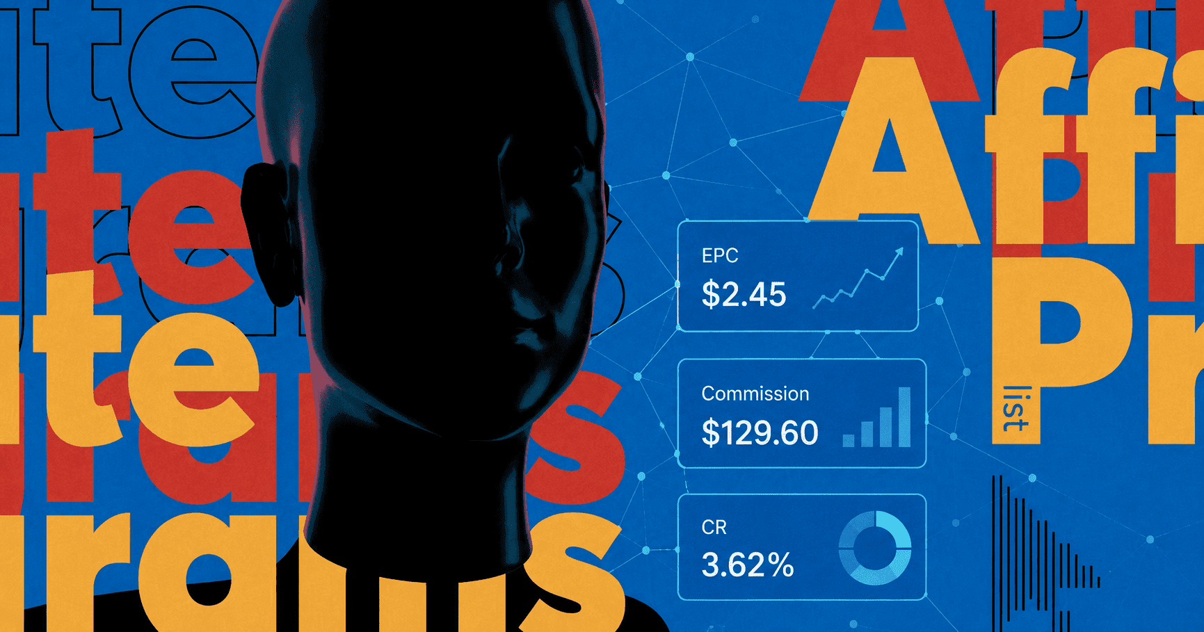
Every media buyer dreads July. Your Cost Per Acquisition (CPA) starts creeping up. Click-through rates (CTR) suddenly fall off a cliff. The natural instinct is to panic, blame the affiliate network, or completely tear down your tracking setup. But the harsh reality is usually much simpler: your creatives are getting completely ignored.
Human attention spans evaporate during the summer. People are no longer sitting in dark, air-conditioned offices casually browsing on 27-inch desktop monitors. They are outside. They are scrolling their feeds with one hand while squinting through heavy screen glare at the beach. They check their phones in quick, frantic bursts while waiting in line for an iced coffee.
You have roughly half a second to stop their thumb. If you are still running highly polished, studio-lit stock photos, you are burning your daily budget. Consumers are utterly exhausted by perfection. More importantly, they are actively rebelling against artificial intelligence.
To survive the summer slump, you have to completely rethink your visual strategy. The ads that convert the highest right now are the ones that do not look like ads at all. They look messy. They look spontaneous. Let's break down the three exact creative trends dominating native and social feeds this summer, and how you can exploit them to drive your CPA back down.
The Anti-Ad Reality: Why Summer Audiences Reject Perfection
Before we look at the specific visual trends, you have to understand the psychological shift happening with consumers. We have reached peak AI fatigue.
Open any social media platform or news site today, and you are immediately bombarded with hyper-realistic, AI-generated garbage. Every image is perfectly lit. Every model has flawless skin. Every background is perfectly symmetrical. Users have developed a subconscious radar for this artificial perfection, and their immediate reaction is to keep scrolling. Perfection signals an advertisement, and nobody logs online hoping to look at advertisements.
To capture attention when people are distracted by summer activities, your creatives need to trigger a pattern interrupt. You have to serve them an image that feels tangible, slightly broken, and unmistakably human. This is not just an artistic choice; it is a direct-response strategy. When an image looks like a real memory rather than a Midjourney prompt, the user naturally pauses to figure out what they are looking at. That pause is all you need to get the click.
Trend 1: Back to Analog (The Pre-AI Rebellion)
We are currently living through a massive visual hangover. Over the last two years, timelines have been flooded with artificially generated images. You know the exact look: glowing skin, unnatural symmetry, and six fingers on a hand if you look too closely. Consumers are sick of it.
The "Back to Analog" trend is a direct rebellion against this algorithmic perfection. It is not just some cheap 90s nostalgia trap. It is a fundamental desire to reconnect with an era when creativity required human hands. When a photo actually captured a physical moment in time, rather than a prompt typed into a software box.
For a media buyer, this trend is a goldmine. Analog aesthetics signal authenticity. They subconsciously tell the brain: “A real human made this, which means this is a real experience.” It triggers childhood memories, builds instant trust, and reminds people of a time before constant digital burnout.
If you want to stop the summer scroll, you need to make your ads look like they were pulled out of a dusty shoebox in an attic. Here is the visual breakdown of how to execute this.
The Texture Layer
Digital ads are flat. Analog ads have physical weight. You want the user to feel like they can run their fingers over the screen.
Stop exporting crisp, high-res PNG files. Start layering your creatives with heavy film grain. Add rough paper textures to the background. Throw in print imperfections, misaligned CMYK colors, or the dirty, high-contrast look of a cheap photocopy. It makes the ad look raw and unfiltered.
The Color Palette
Summer ads usually scream at the user with neon pinks and blinding yellows. Do the exact opposite.
Mute your colors. Pull the saturation down. You want to rely on deep, analog oranges, washed-out neutrals, and muted teals. These colors physically reduce eye strain — which is crucial when someone is squinting at their phone in direct sunlight — and instantly evoke a sense of nostalgia.
The Aesthetic Mechanics
You are trying to replicate the feeling of a disposable camera bought at a gas station. To get this look, use:
- Heavy, blinding flash photography (especially in low light).
- Classic Polaroid frames with messy, handwritten text underneath.
- Light leaks and slight overexposure on the edges of the frame.
- Scrapbook compositions where images look physically cut out and taped together.
Real-World Execution: 2 Analog Examples
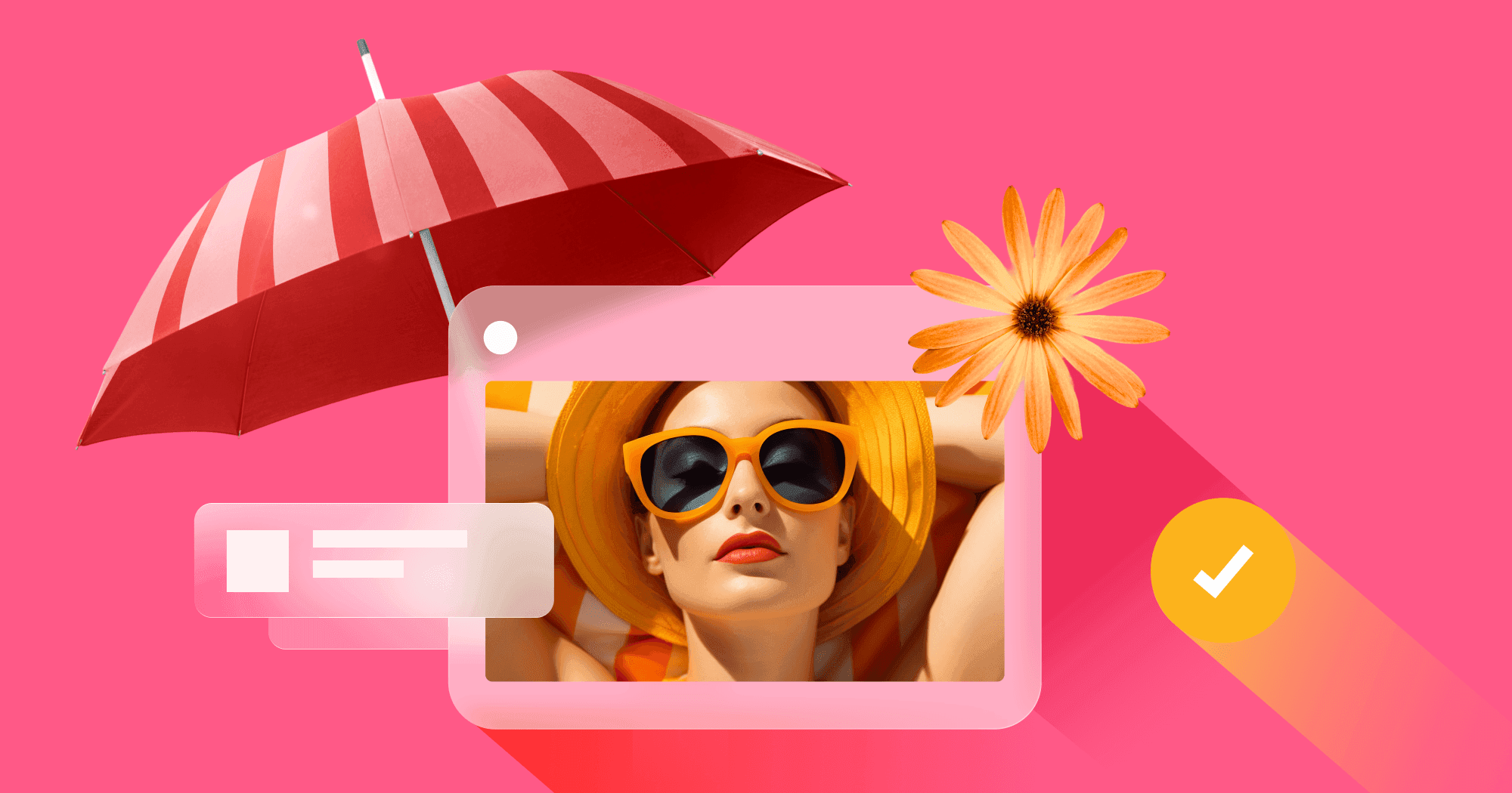
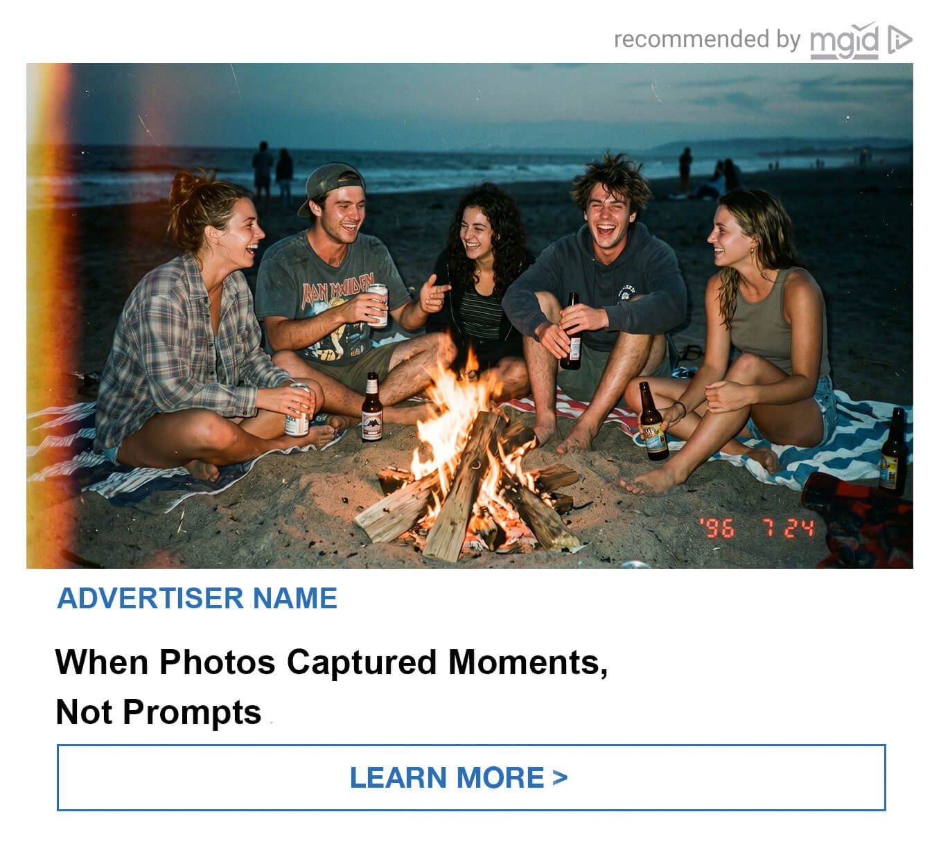
Example 1: The Disposable Camera Bonfire (Lifestyle / Social App Angle)
Your standard ad might show a perfectly lit group of models holding branded drinks on a pristine beach. Delete it. Instead, run an image that looks like it was found in a dusty shoebox from the 90s. The creative is a grainy, low-light shot of friends laughing around a beach bonfire. To make it completely native, throw in a massive orange light leak on the left edge and a glowing red digital timestamp in the bottom corner. Pair it with a headline like: "When Photos Captured Moments, Not Prompts." It doesn't feel like a brand trying to sell you something; it feels like a genuine, stolen memory of a perfect summer night that makes the user want to click.
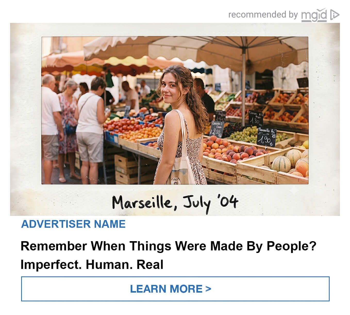
Example 2: The Vintage Market Polaroid (Travel / Experience Angle)
Forget the glossy, heavily edited stock photos of tourists posing in front of famous landmarks. If you are pushing a travel offer, a language app, or a local experience, use the scrapbook approach. The creative is a slightly faded photo of a girl looking over her shoulder at a bustling outdoor fruit market, placed inside a classic Polaroid frame against a dirty paper texture. Underneath the photo, add a messy black marker scribble: "Marseille, July '04." The headline hits the anti-AI pain point directly: "Remember When Things Were Made By People? Imperfect. Human. Real." This visually sells the authentic feeling of exploring a new city, instantly breaking through the banner blindness.
Trend 2: The "Accidental Selfie" (Engineering Authenticity)
If the analog trend is about reviving old-school mediums, this next strategy is entirely about capturing the raw moment. We are watching the complete death of the curated Instagram grid. Audiences — especially younger demographics driving social commerce — are obsessed with weekly photo dumps. They actively celebrate the messy, unfiltered, random moments of everyday life.
For performance marketers, the "Accidental Selfie" is the ultimate native advertising weapon. Both this and the analog trend share the exact same psychological trigger: authenticity. When an image pops up on a publisher site that looks like a blurry photo accidentally taken by a friend walking out of a coffee shop, the brain's internal ad-blocker simply does not fire.
The goal here is not just to make a photo look ugly. The goal is to make it look undeniably believable. Summer is the absolute best time to deploy this. People are naturally outdoors, traveling, and making memories. Your ads need to hijack that exact vibe. But be warned: social media-driven aesthetics burn out incredibly fast. This is a highly profitable, short-term window. You need to exploit this cultural relevance right now before the fatigue sets in and the market moves on.
The Mechanics of a Profitable "Bad" Photo
Breaking your trained marketing habits is going to feel wrong. You have spent years learning how to center a product and light a face. Throw all of that away. To engineer the perfect accidental shot, you have to break basic photography rules on purpose.
Rethink Your Composition:
- Stop centering your subjects. Push them to the far edges of the frame.
- Physically crop out half of the person’s face or chop off limbs at awkward angles.
- Tilt the camera frame entirely. Let the horizon line sit diagonally across the screen.
- Leave unexpected, random objects in the shot. A dirty napkin, a half-eaten sandwich, or a random person walking through the background adds massive credibility.
Drop the Studio Environments: Nobody lives in a white void. Put your product or your subject in aggressively ordinary environments. Shoot in messy bedrooms with unmade beds, cramped kitchens, the driver's seat of a car, crowded airports, or noisy public spaces. The more mundane the background, the more native the ad feels.
Real-World Execution: 2 Accidental Examples
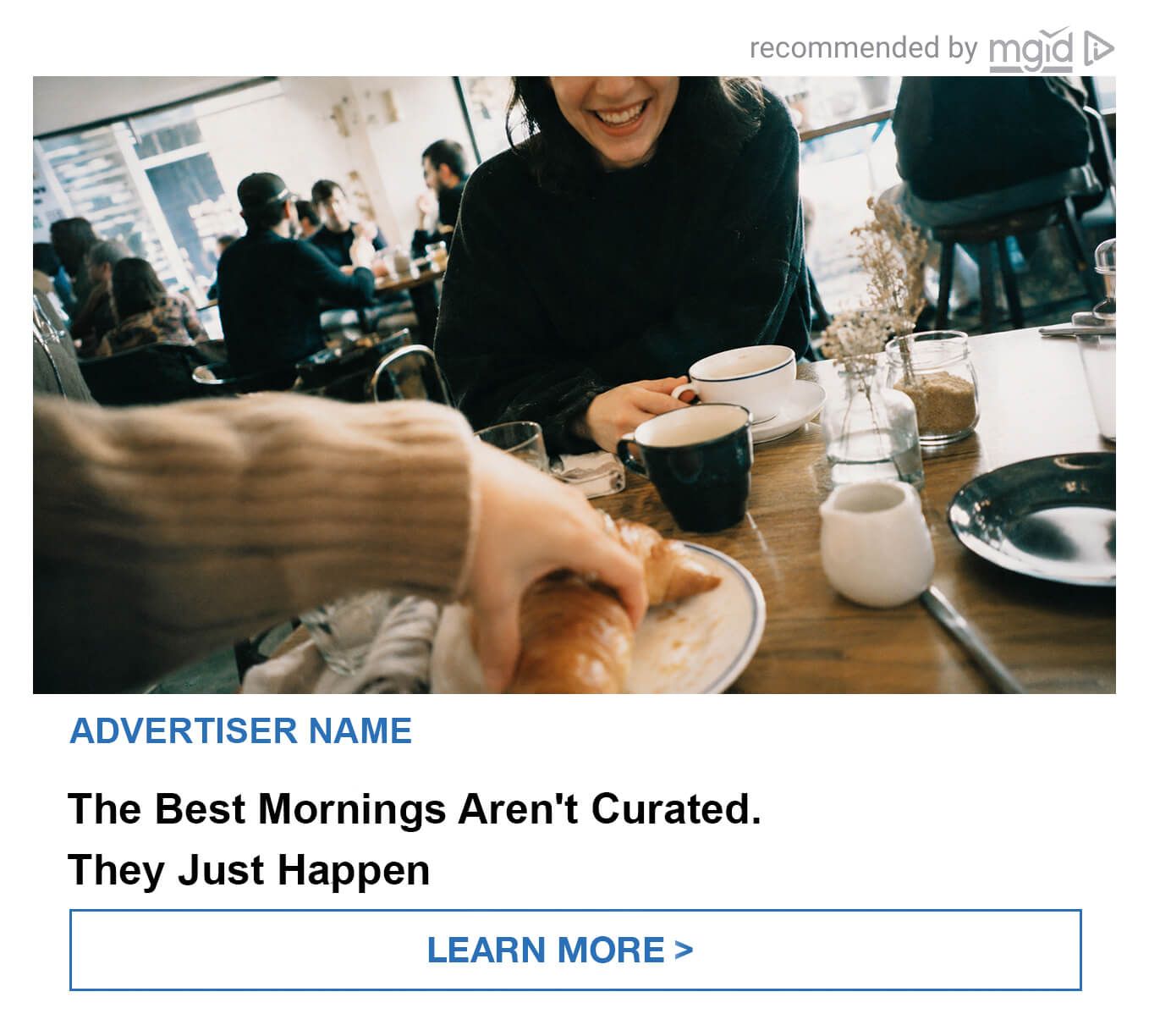
Example 1: The Blurred Breakfast (Lifestyle / Food & Beverage Angle)
Forget perfectly styled food photography. If you are promoting a local delivery app, a dating service, or a lifestyle brand, make it look like a quick snap right before a meal. The creative is a messy POV shot across a crowded cafe table. A heavily blurred arm reaches into the frame to grab a croissant. The person sitting across the table is smiling, but the top half of their face is completely cropped out of the picture. It breaks every standard rule of portrait framing. Pair it with a native headline like: "The Best Mornings Aren't Curated. They Just Happen". It feels exactly like a rushed, happy social media update from a friend, forcing the user to stop scrolling.
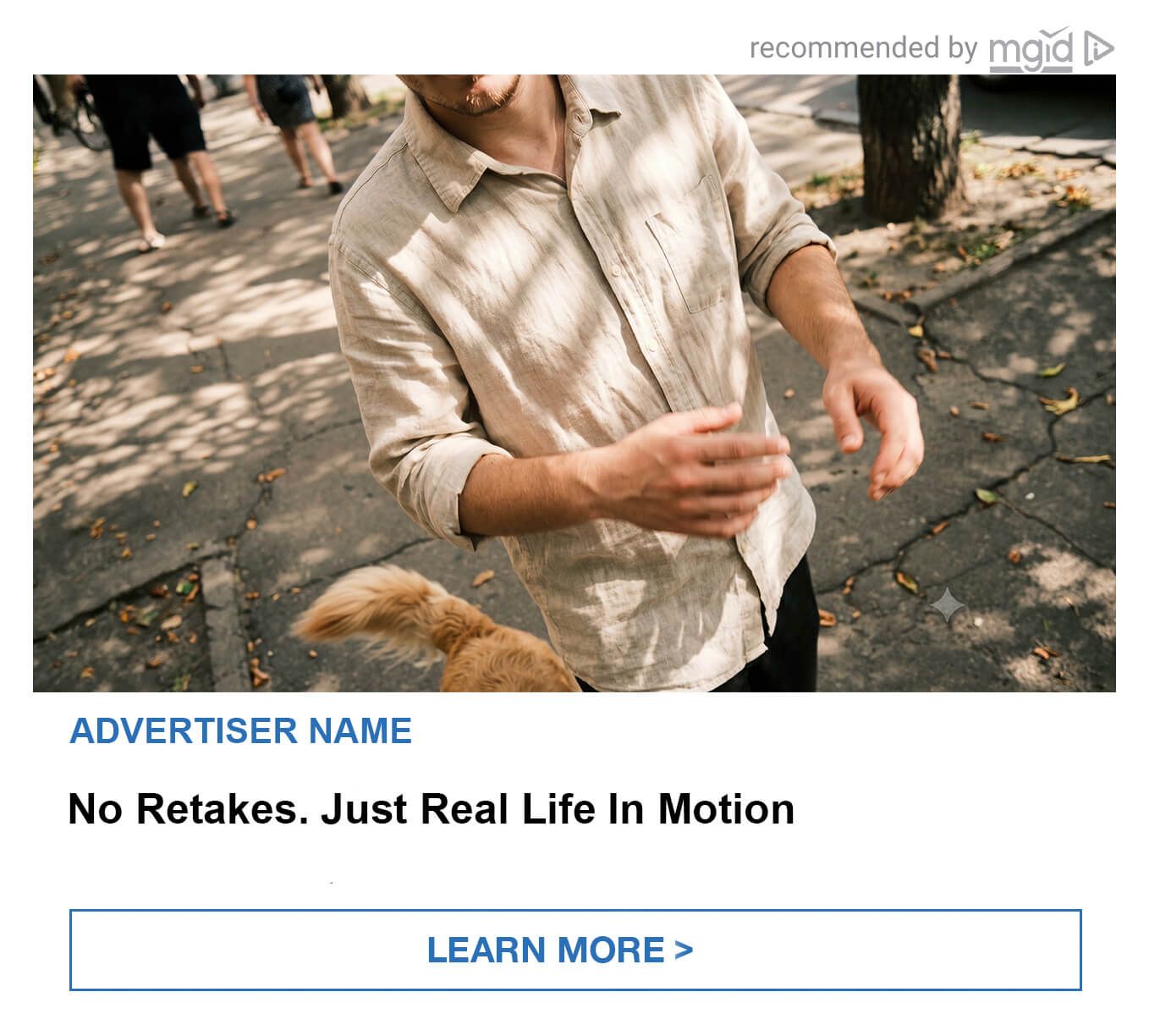
Example 2: The Mid-Stride Crop (Apparel / Pet Care Angle)
Let's say you are selling casual summer wear, an outdoor app, or a pet product. Instead of a posed model smiling directly at the camera, use an image that feels entirely in motion. The shot features a guy walking down a sunny sidewalk, but his head is aggressively chopped off at the top of the frame. You only see a wrinkled linen shirt and his hands caught mid-gesture. A blurry golden dog's tail sweeps through the bottom edge of the photo, while random pedestrians walk out of focus in the background. The text nails the vibe: "No Retakes. Just Real Life In Motion". It is messy, spontaneous, and completely bypasses the user's mental ad-blocker because it looks like a genuine, unplanned weekend snapshot.
H2: Trend 3: Tiny Escapes (The Death of the Luxury Vacation Ad)
Let's talk about the traditional summer travel ad. You know exactly what it looks like. A perfectly manicured hand holding a boarding pass. A pristine straw hat resting on a leather suitcase. A pair of feet hanging out of a Jeep window or propped up on a dashboard.
We need to kill this aesthetic immediately. It is cliché, it is boring, and worst of all, it causes instant ad blindness.
Summer is no longer defined by massive, expensive, three-week luxury vacations. The reality of 2026 is different. People are working remotely from cafes, taking quick sabbaticals, and squeezing their downtime into highly concentrated micro-moments. They are building their summers around small, accessible pleasures: a one-day road trip, a messy terrace party with friends, a quick camping weekend, or just sitting in a local park.
Moving around while answering Slack messages on a phone is just normal life now. The actual "escape" isn't about flying 5,000 miles away. It is about getting a rare chance to pause, take a breath, and actually look at what is in front of you.
When you build campaigns around this concept, you are hitting two massive psychological triggers. The underlying messages are:
- “My summer doesn’t have to be expensive to be memorable.”
- “I don’t need to drain my savings account just to get some rest.”
This angle pairs flawlessly with the "Back to Analog" trend we talked about earlier. When you combine the idea of a cheap, local micro-escape with a grainy, vintage hippie aesthetic, you create an ad that feels deeply personal and completely attainable.
H3: Real-World Execution: 2 "Micro-Escape" Examples
Forget the luxury resort photos. If you want to drive cheap clicks for travel, finance, or lifestyle offers, shrink the scale of your creatives.
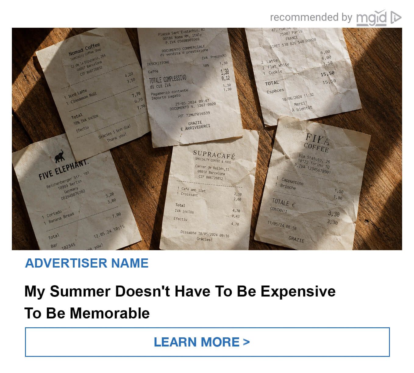
Example 1: The Scattered Receipts (Travel / Fintech Angle)
You are running traffic for a budget travel app, a fintech card, or a local guide. Instead of showing an airplane wing or a sunset, show the actual aftermath of a trip. The image is a tight, top-down shot of a dark wooden table covered in a messy pile of crumpled, stained coffee shop receipts. There are no faces, no passports, and zero luxury indicators. It is just paper. But when you pair this raw image with the headline, "My Summer Doesn't Have To Be Expensive To Be Memorable," it instantly tells a story. It doesn't look like a financial pitch. It looks like the physical, relatable evidence of a fast-paced, budget-friendly adventure. It sparks curiosity without triggering banner blindness.
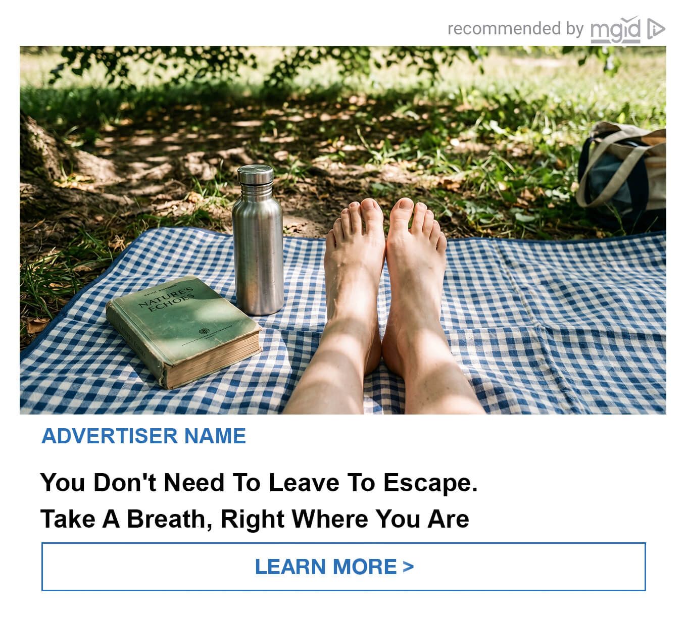
Example 2: The Park Picnic POV (Wellness / Lifestyle Angle)
Say you are pushing a mental health app, an audiobook subscription, or a local outdoor brand. The visual needs to be ridiculously simple. It is a POV shot of bare feet stretched out on a blue checkered picnic blanket under the shade of a tree. Next to the feet, there is just an old green book and a metal water bottle. No models posing for the camera. No heavy corporate branding. Just quiet, shaded grass and a lazy afternoon setup. The headline directly hits the user's fatigue: "You Don't Need To Leave To Escape. Take A Breath, Right Where You Are." It forces people to stop scrolling because it feels like a physical, sensory break from their chaotic social feed. It perfectly sells the idea of a micro-escape just a few blocks away from home.
H2: The Bottom Line: Kill the Polish to Save Your ROI
The summer traffic slump is only a death sentence if you refuse to adapt to how human beings actually behave offline. You cannot force a distracted, sun-drenched audience to care about a perfectly polished corporate pitch. They just don't have the mental bandwidth for it.
Right now, the most profitable move you can make is to become aggressively anti-advertising.
Look at your current top-spending campaigns. If your visuals look like they took a team of graphic designers three weeks to render, or if they scream "Midjourney Prompt #45", you are bleeding money. You have to lower the production value to raise the conversion rate. It sounds completely counterintuitive, and it will probably feel incredibly uncomfortable the first time you upload a blurry, crooked photo of a coffee receipt into your ad account. Do it anyway.
Stop trying to manufacture fake luxury. Stop obsessing over the rule of thirds. Start blending in with the messy, unfiltered reality of a user's actual social feed. Grab your smartphone, turn on the harsh flash, dump your product on a messy kitchen table, and take a photo. Run fifty bucks of test traffic to it.
When you see that raw, "accidental" creative pull a CTR that is three times higher than your expensive studio shots, you will never look at summer advertising the same way again. The audience is begging for reality. Give it to them, and take the profit.