Calls to action, they are just about everywhere: we see them every day on blogs, landing pages and social media! This is for a good reason, too. As any digital marketer knows, an effective call to action is a crucial part of any advertising endeavor. They have the power to make or break a promotional campaign. Whether you’re looking to encourage people to download a piece of software, click on an advertisement or sign up for a newsletter, a call for action is a necessity. So, what is the secret to making your own call to action eye-catching and successful?
Today, we set out to answer this very question. So, if you’d like to know the answer, stick around because we’ll be providing you with a comprehensive list of best practices as well as a selection of call-to-action examples. In this article, you’ll learn everything you need to know about calls to action, and armed with this knowledge, you’ll be able to create one guaranteed to work.
What Is a Call to Action (CTA)?
Whether in the form of a pop-up, banner, button, contextual link or something else entirely, we’re willing to bet that you’ve come across at least one call to action earlier today. But what exactly is a call to action? If you have any amount of interest in digital marketing, it’s very likely that you already have at least a passing familiarity with this term. Even so, a refresher is always helpful!
Call to Action Definition
A call to action — or CTA for short — is a prompt that encourages audience members to take a particular action. In the context of digital marketing, a call to action might be a button on a website, a text link in a blog post or an attention-grabbing banner placed at the top of a web page. Effective CTAs help reduce decision fatigue in your audience by providing them with a gentle nudge toward next steps. On top of that, calls to action are often used to create a feeling of urgency that helps spur consumers to action, thereby boosting conversion rates.
While a CTA’s purpose might differ, whether it be to prompt people to purchase, sign up for a newsletter or book a consultation, at heart, every call to action has the same aim: to keep your audience engaged.
Types of CTAs
There are many different ways to incorporate a call to action into your content. Different marketing goals require different tactics and strategies; oftentimes, the best CTA for a given situation will depend on the ultimate aim. So, you should always think carefully about the impact your call to action will have on audience members and whether or not that’s the effect you’re hoping for.
Additionally, different types of calls to action may appeal more to particular audiences. Sometimes it takes a little bit of trial and error to determine your best call to action option, so you shouldn’t be afraid of experimenting.
A few of the most common calls to action are:
- Banners. Often featuring an attention-grabbing visual design and appealing copy, banners are placed along the top, bottom or side of a web page.
- Buttons. These popular call to actions take the form of buttons with attractive icons and/or actionable phrases and are placed in strategic areas around a web page.
- Contextual links. Often found within the body of a blog post, contextual links is the name given to the clickable text links that lead website landing pages.
- Forms. A call to action can also take the shape of contact forms. These are typically used to sign up for services, newsletters, subscriptions and so on, and they help convert visitors into leads.
- Pop-ups. Buttons and banners can be easy to tune out, but pop-ups — small, windowed CTAs that suddenly appear on a page — are a great way of getting consumer attention.
Key Elements of a Strong Call to Action
When it comes to implementing a call to action on your website, you need to be strategic. As mentioned in the previous section, the CTA you use should be one that helps achieve your final goal and appeals to your demographic — but this isn’t the only factor you should consider.
The best CTAs use various key elements to boost their efficacy. In this section, we’ll examine a few of these elements, explaining why they are so beneficial and detailing how they can be used to create a compelling call to action.
Keep Your Call to Action Short
When it comes to composing a killer call to action, brevity should be your weapon of choice. Keeping things short and sweet will ensure that you make a strong impact on your audience. The best calls to action are the ones that inspire an immediate response; as such, they should be snappy and concise, prompting a snap decision from the viewer. Where possible, we recommend keeping your call to action to under ten words in length. You might feel a little intimidated by this restriction, but trust us when we say that many effective CTAs are even shorter!
Include Emotive Phrases
One of the best call-to-action tips you’ll ever come across is to use language that will provoke an emotional response from your audience. With so few words to work with, you must be particular with the ones you choose.
As a fun exercise, we encourage you to sit down and brainstorm a few call-to-action ideas that might evoke feelings of:
- Excitement: “Join the fun!”
- Intrigue: “Find out more!”
- Optimism: “Discover your dream home!”
- Urgency: “Limited-time offer!”
Personalize Your CTAs
Studies show that, when compared to vague or generic messaging, a personalized call to action is far more likely to lead to successful conversions. In fact, conversion rates for personalized CTAs are over 200% higher than rates for other, less personalized ones. The key to effective personalization is to carefully consider your target demographic, thinking about what is likely to appeal to your audience and using dynamic data to catch their attention. If a website shows a different call to action to the viewer depending on recent page visits, this would be an example of a call to action employing dynamic data to great effect.
One best practice we recommend you follow is to begin your call to action with the name of the viewer, where possible, as this is more likely to grab attention. However, affiliate marketers can go far beyond this: using an Augmented Buyer Persona (ABP), these individuals can create contextualized messages that directly appeal to the viewer.
Use Persuasive Language
A good rule of thumb for any type of call to action is to use persuasive language to convince your audience of what you’re selling. Given how few words you have to work with in your average call to action, it’s especially important that your word choice is compelling and convincing. Call-to-action examples in persuasive writing often include strong, directive phrases.
- “Sign up and save!”
- “Try for free!”
- “Choose us for guaranteed results!”
- “Subscribe for proven tips!”
Great Call to Action Examples
So, we’ve explained what a call to action is, what they’re used for, how they’re implemented and what sets an effective call to action apart from the rest. With all that behind us, it’s time to get to the section you have most likely been waiting for: case studies! In this section, we’ll answer the question: what is a call to action in writing examples, demonstrating what a good call to action looks like. As you read on, keep in mind the tips we’ve given so far — use short phrases, emotive language and so on — and see if you can spot these tips at work.
It’s our hope that the below call for action examples can help stimulate your imagination and make it easier for you to come up with your own CTAs. For every case, we’ll provide a short commentary on what you should look to emulate. Think of each of them as a sort of call to action template, considering the context in which you can use the template in order to help you decide whether or not it is a good fit for you.
With all that out of the way, let’s get into our list of call-to-action examples!
Best Call-to-Action Examples for Websites
In this section, we’ll provide you with a couple of examples of good call-to-action designs for websites — Glossier and its newsletter subscription box and Netflix’s join button. These examples demonstrate how different kinds of call to action can be successfully employed on a website.
Glossier

This example of call-to-action design has a simple, clean aesthetic — as does the rest of Glossier’s website. Not only does this design choice make Glossier’s photograph pop but it also makes their call to action clear and easy to read.
However, it is Glossier’s use of familiar language that makes this call to action stand out. “Let’s take this to your inbox” has a much warmer, personal ring to it than, for example, “Sign up for our newsletter.” Such inviting language is likely to give visitors pause and encourage them to consider leaving their email addresses.
Netflix

Looking at this minimalist call to action design, it’s easy to see how Netflix has become a household name. The visual design is striking: Netflix’s logo pops against its black background, as do the “Sign In” and “Join Free for a Month” buttons. With these buttons colored the same shade of red as the site’s logo, this landing page appears aesthetically cohesive and appealing.
The copy in this call to action is short, simple and effective. In just a few lines of text, they convey three key reasons to try out Netflix’s service: you can watch what you want when you want, you can cancel your subscription whenever you like and your first month is free. All of which are very convincing!
Best Call-to-Action Examples for Email Marketing
Once someone has signed up for your newsletter, the humble call to action doesn’t suddenly lose its usefulness. As you’ll see in this section, you can incorporate calls to action within your emails to great effect, whether it’s to boost sales, request reviews or promote events. Below, we’ve included call-to-action examples from Dollar Shave Club and Molekule. While both are focused on sales, each takes a different approach.
Dollar Shave Club
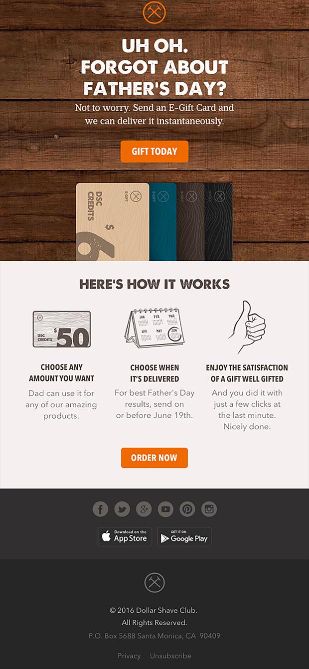
This call-to-action example once again demonstrates the importance of both visual design and copy in promotional materials. The timber background featured in the email header lends the email a rustic aesthetic that might appeal to its target audience — but note that this background doesn’t distract from the message. An orange button stands out quite clearly, as does the blocky white title text.
As far as the copy goes, Dollar Shave Club does an excellent job of creating a sense of urgency here, targeting viewers who may be in need of a last-minute present. Additionally, they highlight how quick and easy the gifting process is, which might just convince the recipient to go ahead and make a purchase.
Molekule
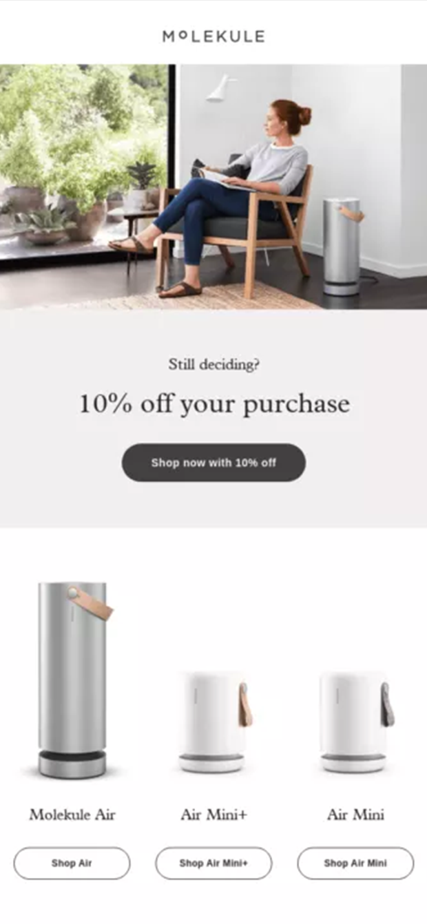
The above call to action from Molekule features a clean, streamlined design, one that seems to echo the design of its products. As well as being aesthetically pleasing, it is also laid out very clearly, so it’s easy to see exactly what the company is offering.
Where Dollar Shave Club’s call to action emphasized a feeling of urgency to encourage viewers to buy, Molekule’s instead offered a discount of 10%. The email displays a minimal amount of text but does feature four clearly labeled buttons, in which the recipient can visit Molekule’s website and browse their wares, perhaps making use of that enticing discount.
Best Call-to-Action Examples for Social Media
Unlike on a website or blog post, where you have an entire page to win your viewers over, on social media, you usually have a few hundred characters to work with. As you can see from our next two call-to-action examples, in writing call-to-action posts for social media you have to be mindful of what little space you have available..
Canva

In Canva’s call to action, the target audience — organizations with teams — is instantly made clear. Both the tweet itself and the attached graphic include the phrase “Canva for Teams.” Additionally, the graphic presents the viewer with an idea of what this service might be like. This image also features bright colors, which are bound to catch the eye of Twitter users scrolling their feeds.
As for the copy in the post, the language used is simple, straightforward and plainly sets out some of the service’s main benefits. The target audience for Canva’s product will instantly understand that this service iss relevant to them, prompting them to click on the link to find out more.
Gap

This Instagram story ad from Gap is an example of how effective a call to action with minimal text can be. In this ad, what you need to know is presented clearly and intelligibly, with a simple white font popping against a black background. In contrast to the simple textual design, there’s a colorful photograph of one of Gap’s ensembles, captivating viewers and displaying what they can buy in the flash sale.
The copy here promotes the sale, of course, showing off the multiple savings available to you when you use the discount codes. If this wasn’t motivation enough, the use of the phrase “flash deals” also creates a sense of urgency, alerting viewers to the fact that such discounts will only be available for a very limited time.
Best Call-to-Action Examples for E-Commerce
E-commerce, one of the world’s biggest industries, is all about online sales. Thereby, it only makes sense that knowing how to craft a compelling call to action is especially important in this sector. Our next two call-of-action examples are from Shopify and Victoria’s Secret, and both have a number of interesting features that are well worth highlighting.
Shopify
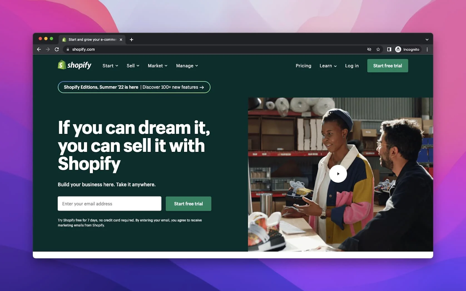
The first thing you’ll notice about Shopify is its very simple and clear design, with easy-to-read text and numerous dropdown menus for ease of navigation. In the call to action button pictured above, the design team has included an enticing three-word phrase that instantly makes it clear what you’ll be getting if you provide your email address: “Start free trial.”
Another thing that stands out about this call to action is the emotive language it uses: “If you can dream it, you can sell it.” This is bound to appeal to the audience’s emotions, encouraging them to take a leap of faith and chase their aspirations.
Victoria’s Secret
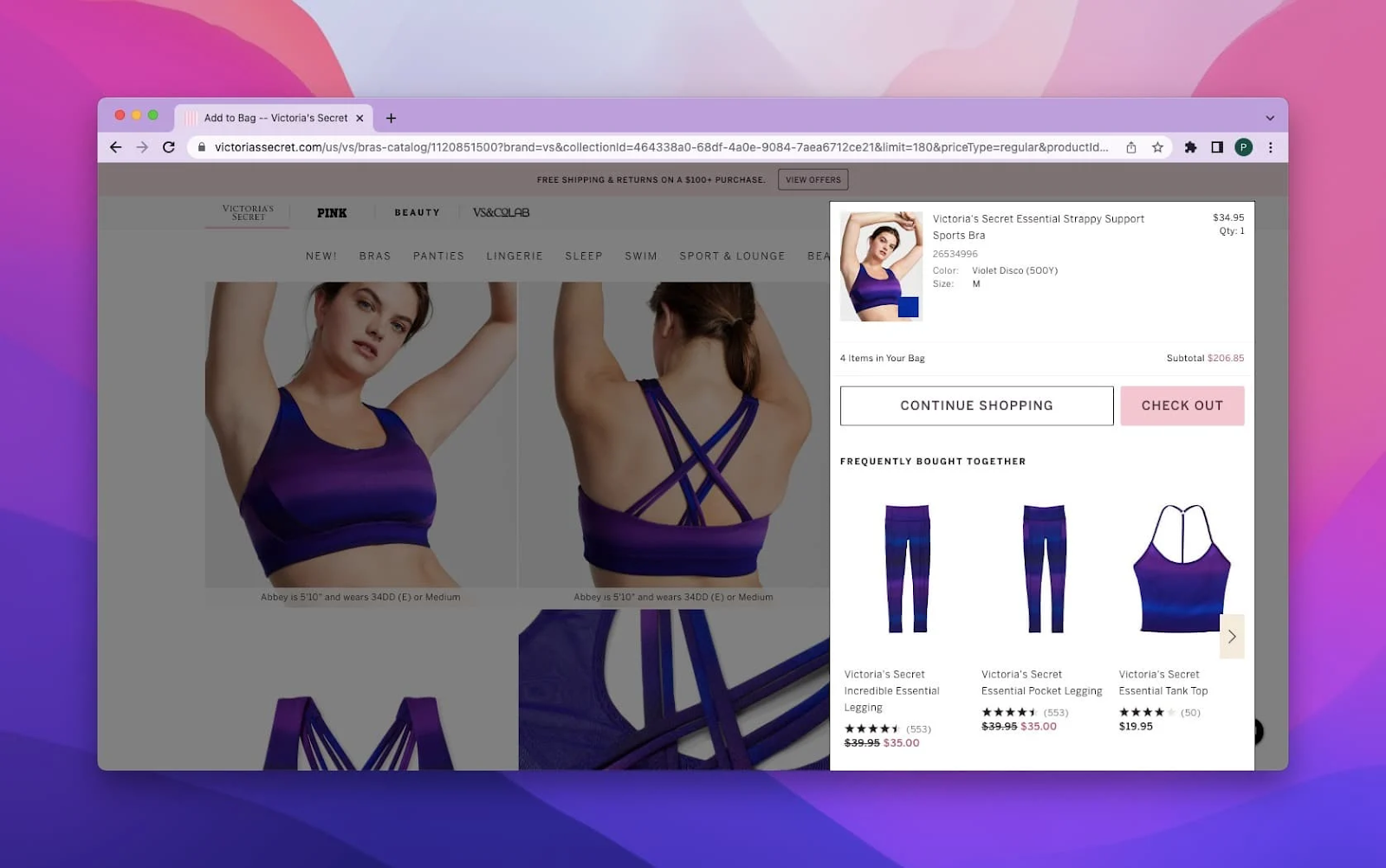
The above call to action from Victoria’s Secret takes the form of a pop-up window that appears once you’ve placed an item in your shopping cart. It features two clearly labeled buttons, “Continue Shopping” and “Checkout,” as well as several suggested products. These offerings might pique a shopper’s curiosity, encouraging them to browse for a little longer.
Another benefit of this clear layout is that it allows viewers to see the price and rating of suggested items at a glance. With such information being made readily available, a follow-up purchase is made all the more difficult to resist.
Best Call-to-Action Examples for Native Ads
We’ve come to our two final examples. The first is a native ad for Fidelity Investment featured on Forbes. The second is a promotion of Cavendish Insurance Broker, featured on ThisIsMoney.uk. These two are great examples of how a call to action can be effectively utilized in native advertising.
Forbes + Fidelity Investment

It’s no surprise that a giant platform like Forbes knows how to do native ads well, and it’s no secret that the article above, “Should You Accept Your Employer’s Pension Buyout Offer,” is sponsored content. And yet, it seems to fit seamlessly in with the site. This is because, while it is clearly branded, the article in question still offers useful information and advice.
The call to action on this page takes the form of a “FOLLOW” button on the left-hand side of the page. Simple and to the point, this call to action does the job while remaining unobtrusive, encouraging readers who found worth in the article to follow for more.
ThisIsMoney.uk + Cavendish
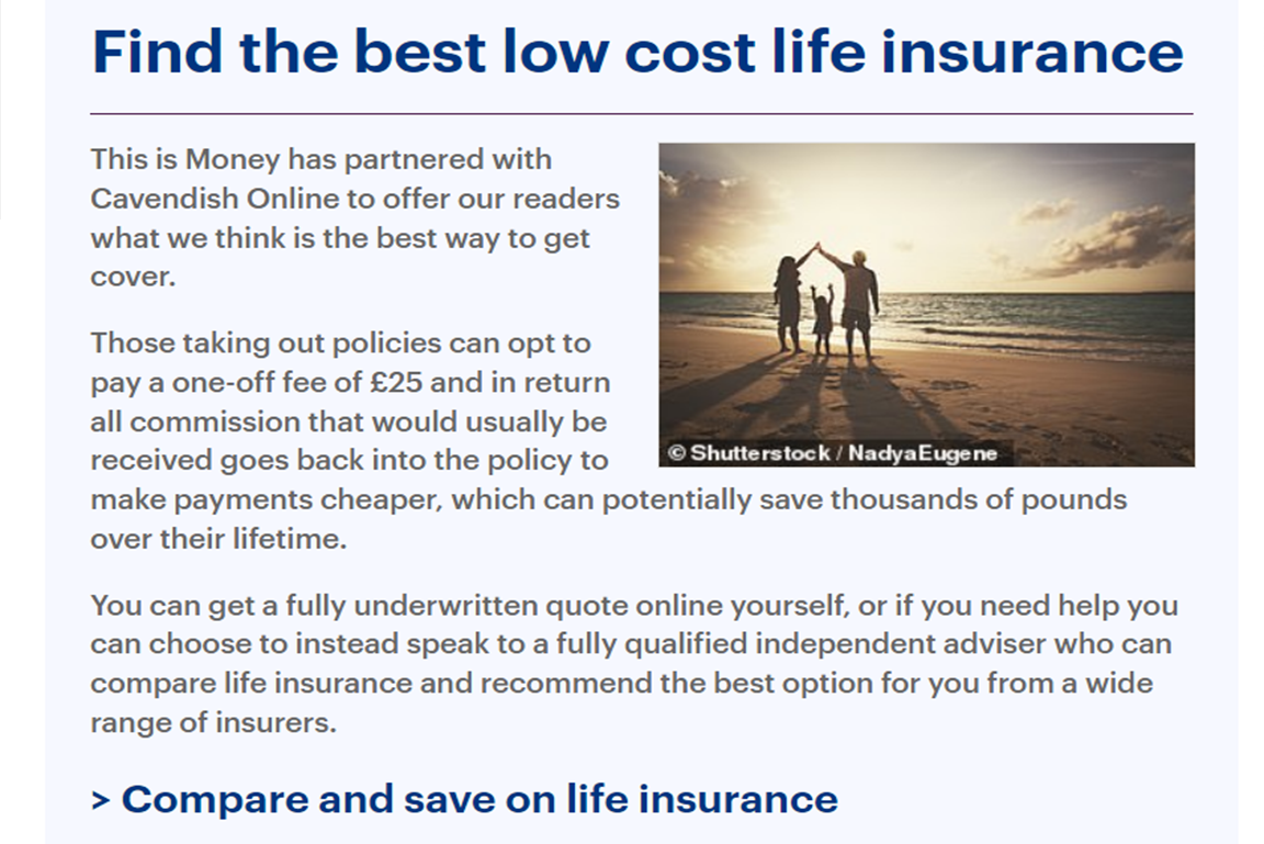
This native ad for Cavendish appears on a ThisIsMoney.uk article for choosing the best life insurance. As with the above example, this ad contains some real, helpful advice, while also providing the reader with more information regarding Cavendish itself.
The call to action link is simple and straightforward, appealing to the reader with the phrase “save on life insurance.” Having just received some great advice on choosing an insurance provider from this article, readers will no doubt trust Cavendish to point them in the right direction and will click the call to action.
Best Practices for Creating CTAs That Work
When creating an effective call to action, it isn’t just the phrasing you need to consider carefully; visual design is also equally important. When putting together your call to action, there are several best practices you should keep in the forefront of your mind. In this section, we’ve included a few examples of call-to-action best practices that are bound to help you create your own, so be sure to study them carefully!
Ensure Your Call to Action Is Clearly Visible
This may seem like a fairly obvious piece of advice, but you’d be surprised how often it’s overlooked! Think about it, though: how frequently do you actually read every line of text on a web page? If you’re like everyone else on the internet, probably not often. Most people are far more likely to scan the page to see if it has what they’re looking for. So, if your call to action isn’t visually distinctive, or if it’s buried between large blocks of texts, it’s unlikely many viewers will find it, much less click on it.
Following these tips can help you ensure your call to action stands out:
- Use a large, clear font;
- Place the call to action at the beginning or end of the text;
- Don’t clutter the space around the call to action;
- Use bold, contrasting colors.
Include More Than One Call to Action
No matter how well you think your call to action stands out, it’s all but guaranteed that at least a few of your visitors will miss it. That’s why it’s a good idea to include multiple call-to-action links or buttons on one page. For the sake of clarity, we don’t mean to suggest that you should add lots of different calls to action in one section — this is likely to just confuse viewers. Rather, we mean that you should include the same single call to action at numerous points throughout the page. This increases the likelihood of your visitors noticing it.
Here are some helpful hints for placing your calls to action:
- Don’t clutter the page with different calls to action;
- Consider placing a call to action above the fold, near the middle and near the end of the page;
- Place buttons at links at even intervals;
- The longer the page, the more calls to action you can add.
Provide Viewers with Context
The best call to actions are ones that are backed up by supporting text — that is, well-written, compelling copy that will give viewers a reason to engage. Make sure that it’s crystal clear what they’ll be getting when they interact with your call to action. Will it sign them up for a newsletter? Will it add a hot item to their shopping basket? Don’t stop there, though. Lay out the benefits they’ll enjoy if they go through with the interaction, whether that’s access to valuable content or a bargain deal on a desirable item.
The below tips will help you write a convincing piece of supporting text for your call to action:
- Keep your target demographic in mind when writing;
- Use persuasive language in your call to action;
- Back up claims with relevant statistics;
- Focus on the pain points your product or service will address.
Include Social Proof on the Page
We can’t overstate how important social proof is in marketing. That’s because testimonials and reviews often help inform consumers’ purchase decisions, with positive ratings helping to confirm that the service or product is as good as advertised. Recent studies show that 75% of people look for reviews before going ahead with a purchase, clearly demonstrating the value of social proof in marketing. Including a reviews plugin, video testimonials or social media screenshots are all valid options here.
Adhere to the following tips when including social proof on your web page:
- Place the content before the call to action so that visitors see it first;
- Make the social proof visible on the page;
- Consider posting testimonials with a photo of the speaker for credibility;
- Remember that influencer reviews are especially beneficial.
FAQs
Why are CTAs important in marketing?
A good call to action can be seen as a signpost for your audience, helping them figure out the next steps in purchasing your product, signing up for your newsletter or anything else. As a general rule, most people don’t have the patience to sift through a web page with a fine-toothed comb to figure out their next steps. Providing clear signage in the form of a clear call to action eliminates this particular frustration, thereby boosting conversion rates. Such is the power of the humble call to action in advertising!
What makes a compelling call to action?
There are loads of steps you can follow to make your call to action as compelling as possible — far too many to cover in the space we have here! But here are a few quick call-to-action tips that will definitely help:
- Personalize your CTAs with dynamic data;
- Keep things short and to the point;
- Use emotive language to engage your audience;
- Create a sense of urgency with your word choice.
What are some examples of effective CTAs?
A good call to action shouldn’t be over fifteen words in length — in fact; ideally, it should be less than ten — and should use simple language, where possible. Additionally, good calls to action examples usually include a strong verb alongside one or two “power words”: attention-grabbing words that are likely to get a consumer excited, like “free,” “limited,” or “save.” For instance:
- “Sign up for free expert advice!”
- “Take advantage of this limited-time offer!”
- “Join and save money today!”
Should CTAs be placed above the fold on a webpage?
The fold of a website is the name given to the point where a loaded page cuts off. This means that anything placed “above the fold” is on the visible part of a page after it has loaded but before the user begins to scroll. This is an excellent location to place your call to action, as this means it will be one of the first things visitors to your page will see. Ideally, however, you should place your call to action in various locations on the page, not just once at the top.
How can I optimize my CTAs for mobile users?
When optimizing your call to action for mobile users, there are several key points to take into account. Firstly, we encourage you to be sparing with the amount of copy you include; oftentimes, when someone looks something up using their smartphone, they’re hoping for a quick, snappy answer. Secondly, ensure that you place your call to action somewhere within the “thumb zone” — that is, in a place that’s easy for thumbs to reach. Finally, try to avoid using pop-ups as much as possible; instead, incorporate them clearly onto the page.
Can CTAs be personalized for different audience segments?
Personalizing a call to action is a great way to enhance its effectiveness. You might do this by including text that will appeal to a specific part of your audience, or you might take a more high-tech approach, such as using dynamic content. This involves the call to action accessing the user’s dynamic data via a database so that it can adapt itself to their browsing behavior. A common example of this is purchase suggestions on websites like Amazon, which change to reflect a user’s recent searches.
How often should I update my CTAs?
Knowing when it’s time to update a call to action can be tricky. Perhaps the clearest sign is when it has lost its effectiveness. For example, if at one point your call to action received a lot of clicks but doesn’t anymore, you can probably take that as a sign to shake things up. Otherwise, you should, at the very least, keep your call-to-action links and buttons relevant to ongoing promotions and updates.
Conclusion
A good call to action can make all the difference when it comes to converting visitors into leads or (even better!) paying customers. After reading this article, you hopefully have a better grasp of just how important CTAs are in digital marketing, as well as an understanding of how to successfully implement them yourself. We’ve covered some of the most crucial call-to-action best practices on this page, including tips for both call-to-action copy and visual design. Integrating our advice into your approach to calls to action will boost their efficacy by making them more attention-grabbing and compelling.
Taking a look at the examples in this article can give you some idea of how to put these tips into practice. Whether you’re looking for call to action ideas for websites, email marketing campaigns, social media, e-commerce stores or native ads, you should have found something here that inspired you. Hopefully, this inspiration will make it a little easier for you to put together your own call to actions.
With all that said, if, after having read this article, you still have questions about how to create CTAs that convert, we, at MGID, would be more than happy to help you. Our team is made up of digital marketing experts who have years of experience behind them and know a thing or two about making the perfect call to action. If you’re in need of some guidance, there really is no better company.
That’s not all. If you create an account with MGID, you not only will have access to our creative specialists but also will benefit from the support of your very own personal manager. On top of that, we offer a range of high-quality publishers for you to take advantage of, as well as a selection of advanced marketing tools to help you up your game. Click here to find out more about the many other benefits of our service.
So, what are you waiting for? Sign up for our services today, and we’ll work to help you achieve your goals. With MGID on your side, the sky’s the limit!