The "successful success" aesthetic had a good run, but audiences are burned out on over-polished luxury and fake smiles. It just feels cold now.
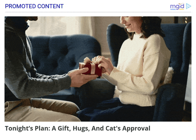
This year, love is not measured by the amount on the price tag. Instead, people are leaning into the heart of the holiday. In fact, we are seeing a hard pivot toward cozy, everyday romance. Forget the model posing next to a sports car. Give us a messy kitchen, morning coffee and an inside joke.
For this Valentine’s Day, brands need to stop selling the object and start selling the feeling that comes from someone understanding you.
Creatives: Shift the Perspective
Most ads treat the viewer like they are an outsider looking in. That doesn’t work anymore. You have to pull them inside the advertising.
The POV Shift
Static product shots are boring and lifeless. To get pulses racing this Valentine’s Day, brands are using First-Person Perspective (POV).
- Old School: A ring box sitting on a velvet shelf
- Right Now: A hand reaching out or a view from the recipient's eyes as they take in the gift
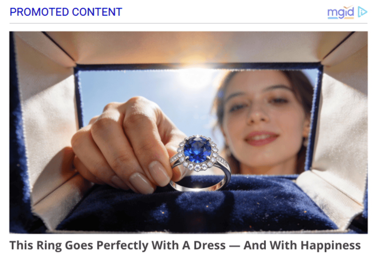
It’s a simple brain hack. The viewer is no longer watching the same old scene play out; they are in the scene. This unique perspective makes them feel like part of the advertising: it’s not just their hand, it’s their moment.
Get Up Close and Personal
Ditch the wide angles. Zoom in. Focus on fingers touching, a slight caress and eye contact. The product is just a prop. The connection is the hero.
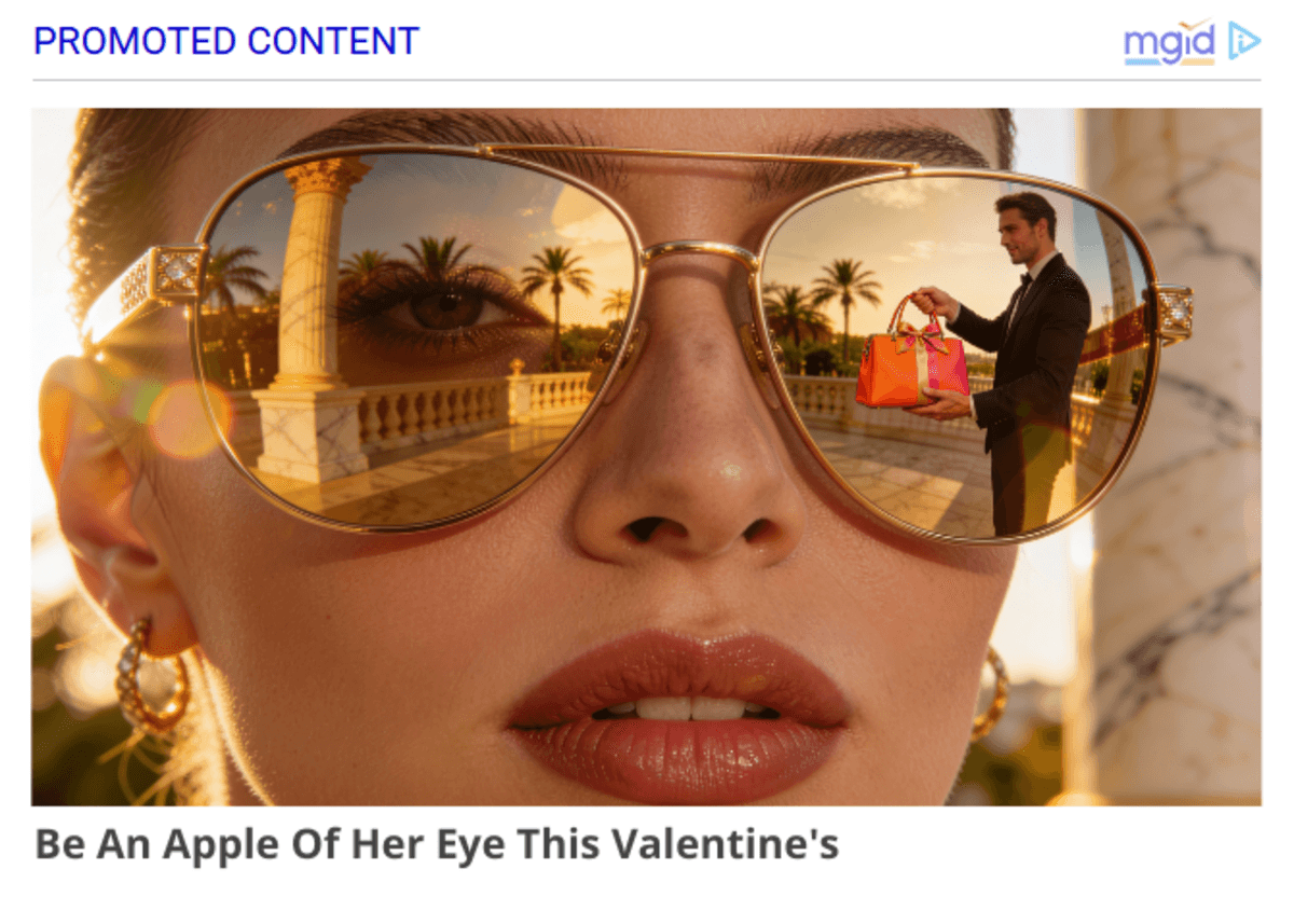
"I See You" vs. "I Bought You This"
Gifting isn't a status symbol anymore. It’s an empathy test. Take sunglasses. Don't frame them as a luxury flex. Frame them through the eyes of a partner who knows exactly what fits their loved one’s style. The message isn't "I spent money." It’s "I know who you are."
Design: Temperature and Texture
Stop playing it safe with color wheels. The most effective ads this year are breaking the traditional rules of contrast.
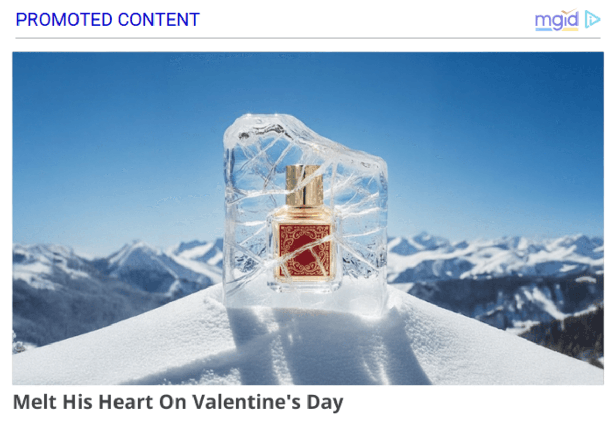
Ice vs. Sun
Visual tension sells. We are seeing a huge spike in hot-on-cold designs. Picture a warm, glowing gift box sitting on a block of ice or a vibrant red item against a stark, freezing blue backdrop. It works because the contrast creates intensity. It pops off the screen faster than a neon sign.
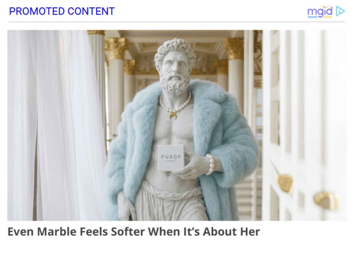
The White-on-White Power Move
We understand that this sounds counterintuitive. Why put a white box on a white statue? Won't it disappear? Actually, no. It forces the viewer to look closer. When you strip away the color contrast, you highlight the texture. You see the grain of the paper, the ribbon's satin finish, the light hitting the edges. It’s a subtle flex that says premium without screaming it.
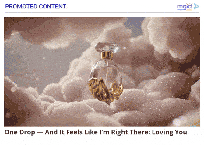
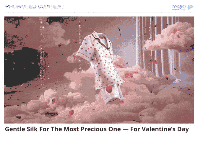
Invite Backgrounds Tell the Story
Empty space is a wasted opportunity. The background should explain the product’s soul. Floating petals or soft, drifting clouds aren't just filler. They set the emotional weight. Is this gift light and dreamy? Or heavy and solid? Don't just show the item; show the atmosphere it lives in.
Tech: Make It Breathe
Static banners are basically invisible now. Our brains are trained to ignore anything that doesn't move. But shooting full video content for every single SKU? That burns budgets fast.
Static-to-Motion
Creating motion in your ads doesn’t need to come with a hefty price tag. You don't need a film crew: you need AI tools that turn a photo into a living scene.
That’s exactly what MGID’s AI-powered Image-to-Video tool can do. It’s a smart, scalable way to transform your static assets into dynamic video clips instantly.
We aren't talking about complex animation. Our Image-to-Video tool creates ads that breathe. Whether that’s background clouds slowly drifting by, a light flare traveling across the gift box or rose petals falling softly, this type of motion catches the eye just enough to stop the scroll.

Quick Text Refresh
Don't stop at the visuals. If you need a quick refresh for your headlines, we’ve got a tool for that too.
Check out the new Valentine’s Day strategy in the MGID Dashboard (available for manual generations). It automatically churns out holiday-optimized titles that fit the moment. You don't need to change your creative or your landing page. Just swap the text. It’s a low-effort tweak that keeps your ads timely while everyone else is scrambling to write new copy.
Rich Media: The "Touch" Factor
Interactive ads (Rich Media) aren't new. But for Valentine’s Day? They are a perfect strategic fit.
Don't show a discount code. Hide it. Make the user swipe to unwrap a virtual ribbon, or use a "scratch-off" layer to reveal the surprise. When a user touches the screen, they commit, transforming from a passive observer into an active participant. That small action skyrockets conversion rates.
The Bottom Line
The best campaigns this year won't look like ads. They will look like memories.
Stop chasing perfection. It’s boring. Instead, chase the sentiment behind Valentine’s Day. The market is loud, but intimacy cuts through the noise better than any discount sticker.
Use tech to grab attention, but employ empathy to keep it. Whether it’s a hand reaching out in POV or a subtle motion effect on a static image, the goal is the same: make it feel real.
Get your creatives out there. In 2026, real beats perfect every single time.