A good ad placement earns its space on the page.
More ads, more revenue? If only website monetization were that simple.
An ad that grabs attention can also interrupt a good read. A placement that looks profitable on paper might quietly push visitors away. And the spot that works beautifully on a desktop article could be a disaster on mobile.
So, where should your ads actually go? The answer depends on what readers came to do, how they move through the page and what happens after an ad appears. We'll look at real placement scenarios, compare options for different page types and build a testing plan that helps you decide what deserves to stay — and what needs to go.
- How to Choose Where Your Ads Go
- What Is Website Ad Placement?
- Why Ad Placement Matters
- Common Website Ad Placements
- Choosing Ad Placements by Page Type
- Website Ad Placement Examples: Short Articles vs. Long Guides
- Ad Formats and Their Placement Considerations
- Ad Placement Mistakes and Standards
- How to Test Website Ad Placements
- How to Interpret Your Ad Placement Test Results
- When to Keep, Revise or Remove an Ad Placement
How to Choose Where Your Ads Go
Before you give an ad a spot on your website, make sure it deserves to be there. A little planning now can save you from a layout that earns a few extra impressions while driving readers up the wall.
Here's a simple way to approach the decision:
- Page purpose: What did visitors come to do? Read an article, follow a tutorial or browse content? Different goals call for different layouts.
- Reading pattern: Where do people pause, scroll or leave? These behaviors can reveal natural opportunities for ad placement.
- Candidate placement: Could an ad work between sections, in the sidebar or at the end of an article? Start with a location that fits the page.
- Reader impact: Will the ad interrupt a thought, crowd the screen or make the next paragraph harder to reach?
- Measured outcome: Did the placement improve revenue without hurting reading completion or return visits?
Treat these steps as a starting point. Even the most promising placement on paper can flop once real readers get involved.
What Is Website Ad Placement?
One thing worth clearing up: ad placement and ad format are two different things.
- Placement is where the ad appears: in-content, sidebar, above the fold or at the end of an article.
- Format is what appears there: a display banner, native ad or video ad.
For example, an in-content placement could hold a display banner or a native ad. The location stays the same, but the experience can change considerably depending on the format.
Available placements also depend on your website layout, the devices your audience uses and the options supported by your ad network. A sidebar might make perfect sense on desktop and disappear entirely on mobile.
Why Ad Placement Matters
An ad can be perfectly designed, relevant to your audience and backed by a healthy advertiser budget. Put it in the wrong place, though, and all that effort might go unnoticed.
Placement shapes the entire visit. It affects how easily people move through your content, how far they read and whether they feel like coming back.
Let's look at what's at stake:
- Visibility and attention: An ad buried where few visitors scroll has limited opportunities to be seen. Move it higher, and visibility may improve, although that doesn't automatically translate into more clicks or revenue.
- Reader experience: Ads compete with content for screen space. A poorly timed interruption can make an otherwise enjoyable article feel like an obstacle course.
- Relevance and context: Where an ad appears can influence how naturally it fits the surrounding content. A relevant recommendation near a related topic may make more sense to readers than the same ad in an unrelated section.
- Revenue and retention: A placement might generate more impressions or increase page RPM while hurting reading completion or return visits. Both sides of that equation deserve attention.
And here's the catch: the most visible spot isn't always the most valuable one. A placement can attract plenty of attention while making the page harder to use. That's why visibility, revenue and reader behavior need to be evaluated together.
Common Website Ad Placements
There's no shortage of places to squeeze an ad onto a webpage. Making that space work for both your readers and your revenue takes a little more thought.
So, which options are worth considering, and where can things go sideways?
Above the Fold

Above the fold refers to the part of a webpage visitors see before scrolling. It's prime screen real estate, which makes it tempting to fill with advertising.
An ad here has an opportunity to be noticed early, especially on desktop pages with enough room for both content and advertising. But screen space comes at a premium. On mobile, a large ad near the top can push the headline or opening paragraphs out of view.
Worth testing: On desktop category pages or article layouts where the main content remains immediately accessible.
Watch out for: Ads dominating the first screen, delayed access to content and poor mobile experiences.
Below the Fold

Below-the-fold placements appear farther down the page, after visitors start scrolling. They may receive fewer impressions than placements near the top, but they can reach readers who are actively exploring the content.
Their performance depends heavily on how far people scroll. An ad halfway through a long guide has a different opportunity to be seen than one buried at the bottom of a short news article.
Worth testing: On pages with consistent scroll depth and natural breaks between sections.
Watch out for: Low scroll depth that limits the placement's opportunity to be seen.
Sidebar

Sidebar ads sit beside the main content, typically on desktop websites. They can provide additional advertising space without inserting an ad directly into the article.
Sounds convenient, right? Until your viewability data tells a different story.
A sidebar placement may work well on a spacious desktop layout, but its actual visibility depends on the page design and reader behavior. On mobile, sidebars often move below the content or disappear altogether.
Worth testing: On desktop articles and category pages with a clear, uncluttered sidebar.
Watch out for: Low viewability, visual clutter and layouts that don't translate well to smaller screens.
In-Content

In-content ads appear between paragraphs or sections of an article. Because readers encounter them while moving through the page, these placements can offer opportunities for visibility.
Timing matters here. Drop an ad halfway through an explanation, and you've just made the reader work harder to follow the story.
A placement between two complete sections may feel more natural, especially in longer articles. Shorter pieces leave less room for interruption.
Worth testing: Between substantial sections of long-form content or at a natural pause in an article.
Watch out for: Breaking the reading flow, excessive ad density and ads that are difficult to distinguish from editorial content.
End-of-Article
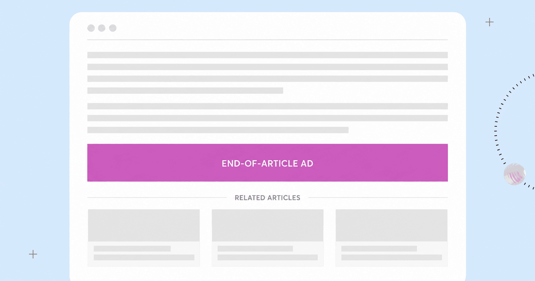
An end-of-article placement appears after the main content, often before related articles or other recommendations.
It gives readers room to finish what they came for before encountering another advertising opportunity. The trade-off is reach: visitors who leave early will never see it.
This position can be particularly relevant for clearly labelled native recommendation units, although performance depends on the audience and page layout.
Worth testing: On articles with strong completion rates and an established related-content section.
Watch out for: Low exposure and competition with editorial recommendations or other next-step links.
Interstitial and Overlay Placements

Interstitial ads appear during transitions or temporarily cover part or all of the page. Overlay placements sit above the page content, sometimes remaining visible as users scroll.
They're hard to miss. Unfortunately, that's also where the trouble can start.
Some implementations interfere with navigation, obscure content or make dismissal unnecessarily difficult. Others are more limited in size and disruption. Their acceptability depends on the specific experience, device and applicable advertising standards.
Worth considering: Only when the ad's size, timing and behavior comply with applicable standards and the impact on readers has been evaluated.
Watch out for: Obstructed content, accidental clicks, difficult dismissal and formats identified as unacceptable by the Better Ads Standards.
Choosing Ad Placements by Page Type
A placement that works on one page can be a spectacular waste of space on another. And sometimes, the difference comes down to something as simple as screen size.
Someone browsing a category page is looking for something worth opening. Someone halfway through a detailed guide is trying to follow an explanation. Give them identical ad layouts, and you're ignoring half the picture.
Here are three starting points worth testing:
| Page type | Candidate placement | Why test it | Main reader risk | Metric to inspect |
|---|---|---|---|---|
| Mobile article | In-content, after a complete section | Reaches readers who have already engaged with the article | Interrupts reading on a small screen | Reading completion |
| Desktop article | Sidebar | Adds advertising space outside the main reading column | Low attention or visual clutter | Viewability |
| Category/list page | In-feed, between content cards | Fits the natural browsing pattern | Ads may be mistaken for editorial links | Next-page clicks |
These are starting hypotheses. An end-of-article unit might make more sense than an in-content ad on a short mobile article. A long desktop guide could benefit from placements between sections, while a category page with limited space might need a lighter approach.
Even two pages with similar layouts can behave differently if their audiences have different reading habits. And don't crown a winner based on one metric. A placement that improves viewability but sends reading completion into a nosedive deserves a closer look.
Website Ad Placement Examples: Short Articles vs. Long Guides
Article length changes the placement game. A quick news update and a detailed how-to guide might share the same website, but they don't give you the same room to work with.
Let's see what that means in practice.
Example 1: A Short Article
Imagine a 400-word article that takes just a couple of minutes to read. There's barely enough room to develop the story, let alone squeeze ads between every few paragraphs.
A possible approach: Keep the main article uninterrupted and test a clearly labelled ad unit after the final paragraph, before related content.
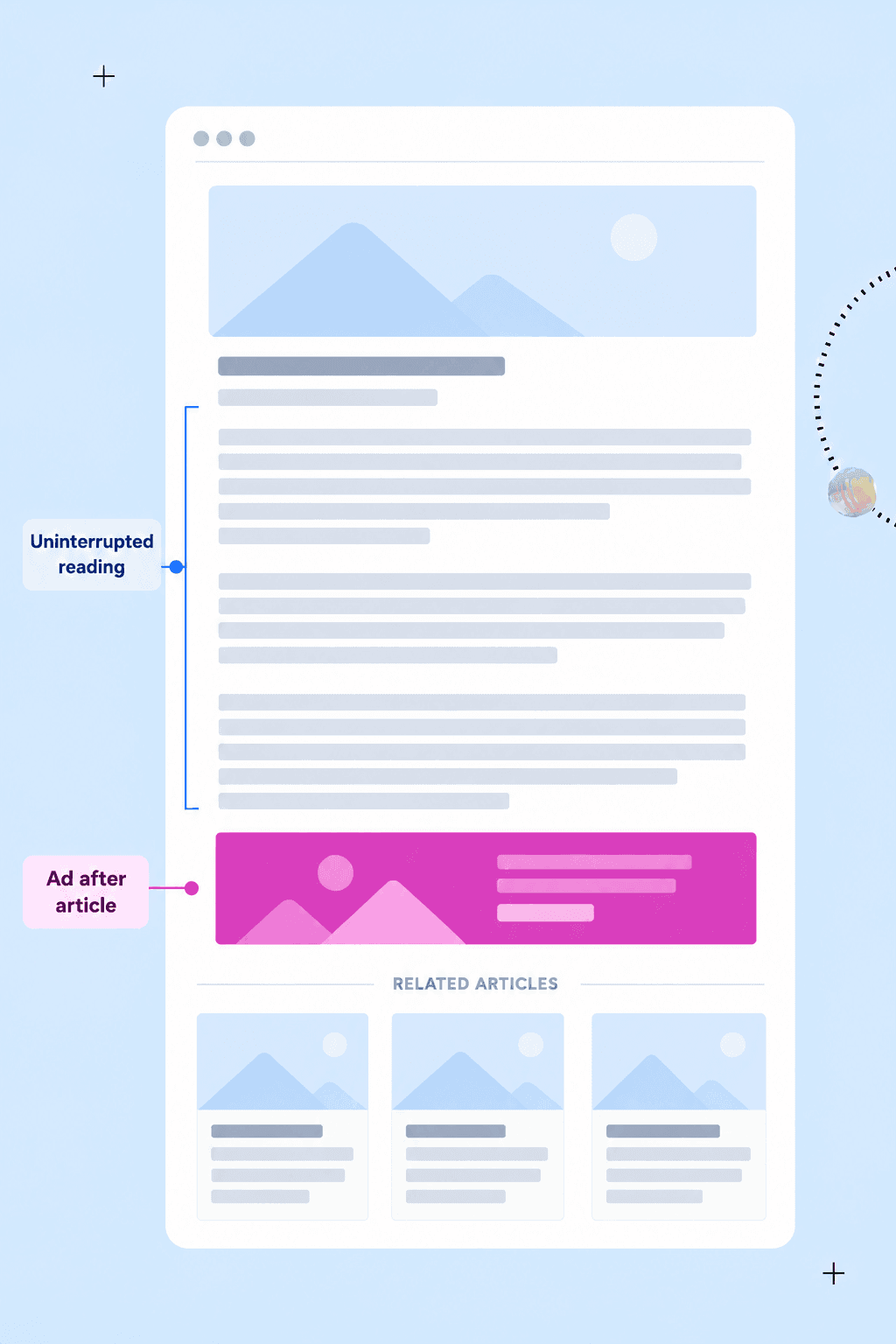
The upside is simple: readers can finish the article without an ad interrupting the story. The catch? Visitors who leave before the end won't see the ad, which may limit its revenue potential.
For a short article, that's a trade-off worth testing before adding more advertising to the page.
Example 2: A Long-Form Guide
Now picture a 3,000-word guide with several sections, examples and practical instructions. A longer reading journey creates more potential ad breaks, provided they fall between complete sections.
A possible approach: Keep explanations, examples and step-by-step instructions together. Test clearly labelled in-content ads between major sections, where readers have reached a natural pause.
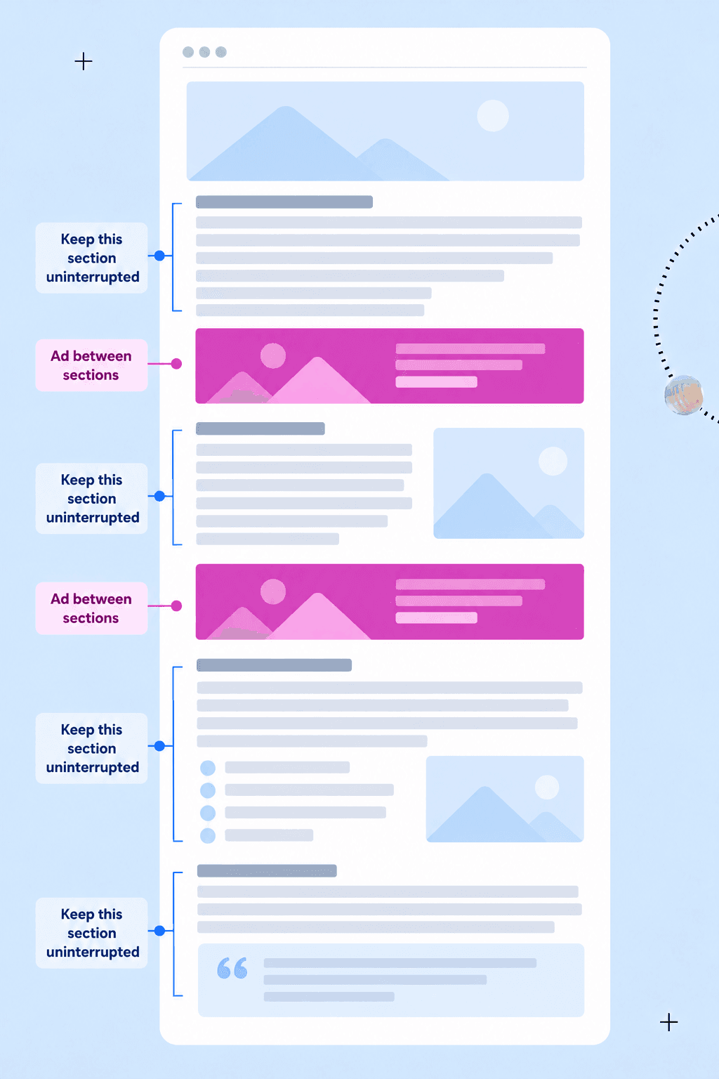
The upside is more opportunities for ad exposure throughout the guide. The risk is turning a useful resource into an endurance test if ads appear too frequently or interrupt important explanations.
Start with a limited number of placements and see how readers respond before expanding.
Ad Formats and Their Placement Considerations
You've found a promising spot for an ad. Now it's time to decide what to put there.
A compact display banner and an autoplay video can occupy the same location while creating very different experiences. Format affects how much space an ad needs, how it behaves and how readers interact with the surrounding content.
Display Ads

Display ads typically use images, text or animation to deliver an advertising message. They can appear above the fold, in sidebars or between content sections.
The tricky part is getting the size and location right. A banner that sits comfortably beside a desktop article might take over a mobile screen. Place it too far from the reader's attention, and it may barely get noticed.
Placement priority: Match the ad's dimensions to the available space without crowding the content or causing layout shifts.
Video Ads

Video ads bring movement and, sometimes, sound into the equation. Depending on whether they're instream or outstream, they may appear within video content or in standalone placements across a webpage.
That extra activity can attract attention, but it also creates more opportunities to annoy readers. Autoplay behavior, sound, placement size and whether the video follows users as they scroll all influence the experience.
Some video placements may attract stronger advertiser demand, but that potential means little if playback disrupts the page or drives readers away.
Placement priority: Consider how playback behavior affects reading, navigation and page performance. Give readers appropriate control and check the relevant advertising standards.
Native Ads

Native ads are designed to fit the look and structure of the surrounding website. They may appear as sponsored recommendations, in-feed cards or clearly labelled content units after an article.
The closer an ad looks to editorial content, the more important transparency becomes. Readers should always be able to tell when they're looking at advertising, even if the unit fits perfectly into the surrounding layout.
Blending in doesn't guarantee better engagement. Relevance, placement, creative quality and audience behavior still determine how a native unit performs.
Placement priority: Choose natural positions within the page structure and make sponsored content clearly distinguishable from editorial recommendations.
Ad Placement Mistakes and Standards
There's a fine line between making an ad noticeable and making it impossible to ignore. Cross it, and even a potentially profitable placement can become a reason for readers to leave.
Some mistakes are easy to spot. Others look perfectly reasonable until you check how people actually use the page.
- Crowding the first screen: A large header ad might attract attention, but it can also push the content visitors came for out of view. This is especially risky on mobile, where screen space is already tight.
- Interrupting content at the worst possible moment: Dropping an ad between a question and its answer, or halfway through a step-by-step explanation, makes readers work harder than they should.
- Adding more ads than the page can comfortably hold: Extra units create more opportunities for impressions, but they can also increase clutter, affect page performance and compete with the content.
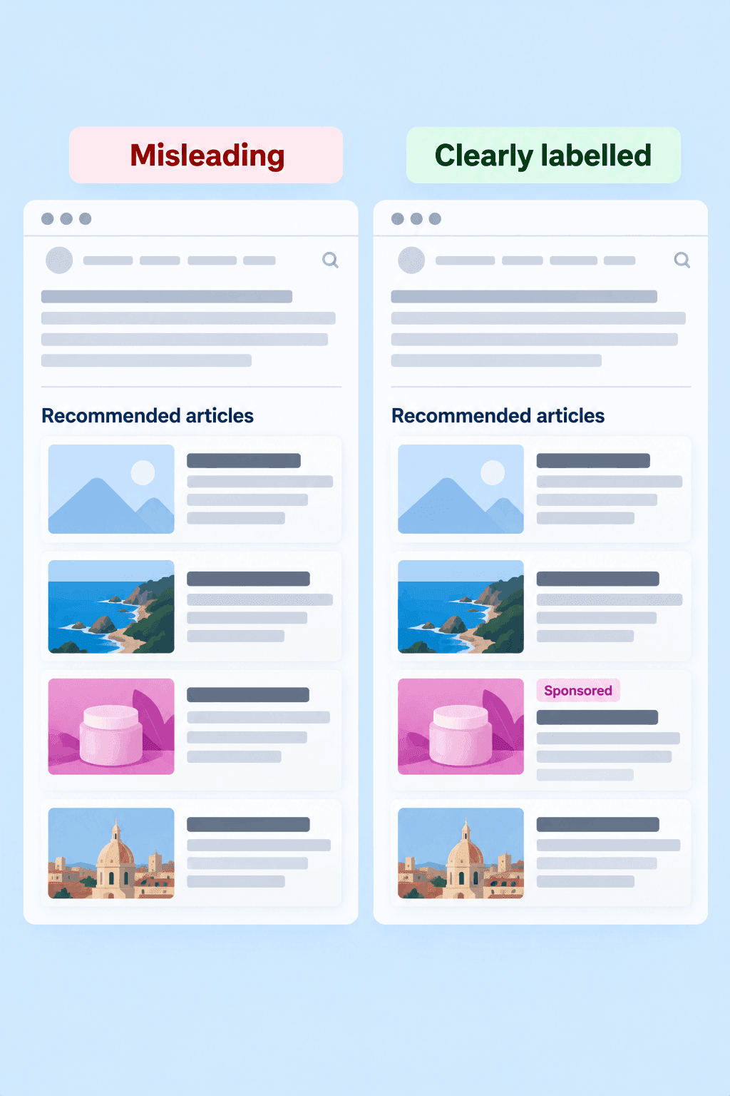
- Disguising advertising as editorial content: When a sponsored recommendation looks identical to an organic article link, readers may click without realizing it's advertising. Clear labelling helps avoid that confusion.
- Ignoring the mobile experience: Small close buttons, ads overlapping navigation and layouts that force awkward scrolling can turn a routine visit into a frustrating one.
What the Better Ads Standards Actually Say
The Better Ads Standards identify advertising experiences that consumers have found particularly disruptive. They address specific formats and behaviors, including certain pop-ups, prestitial ads, sticky placements, autoplay video experiences and excessive ad density.
The details matter. A small sticky unit and an oversized overlay aren't necessarily treated the same way. Desktop and mobile experiences also have different considerations, and the applicable thresholds depend on how the ad experience is defined and measured.
Ad-density thresholds are another example of why definitions matter. They apply to specific advertising experiences and measurement methods, so they shouldn't be confused with a simple rule about how much of the first screen an ad can occupy.
Before testing a potentially intrusive format, check the applicable standards for the specific device and ad behavior. And remember that meeting a standard is only the starting point. Your audience may still find a technically acceptable placement irritating.
MGID's Practical Recommendations for Publishers
Drawing on its experience working with publishers, MGID recommends starting with a few sensible placement principles. Think of them as editorial guidelines rather than hard-and-fast rules or official Better Ads requirements.
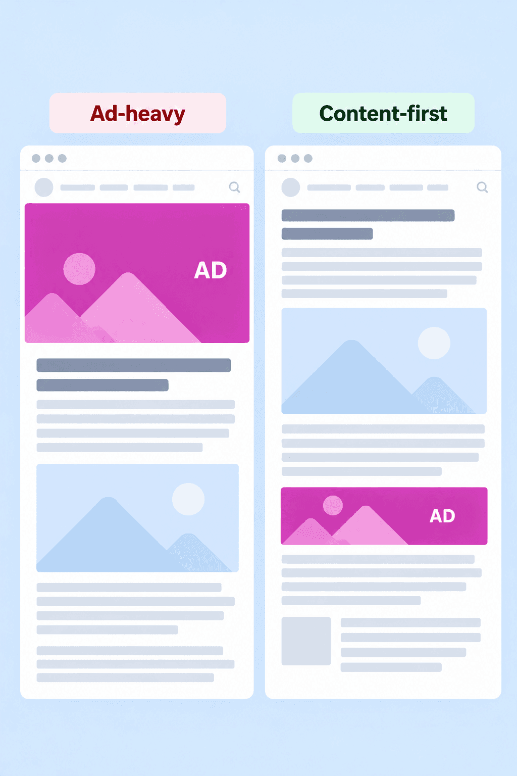
1. Keep the First Screen Content-Led
Your visitors came for the content. Making them hunt for it behind a giant ad isn't the warmest welcome.
On mobile article pages, keep headlines and opening content easy to reach. On desktop, header ads may be worth testing when there's enough room for the article to remain prominent.
On desktop, keep the first screen focused on the article, with advertising taking a supporting role. There's no single ratio that works for every layout, so use reader behavior and placement performance to judge whether the balance feels right.
2. Start With a Lighter Native Ad Layout
It's tempting to fill every available gap with another ad unit. Your readers might have other ideas.
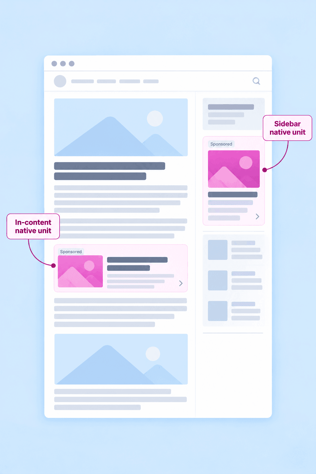
For some article pages, starting with one in-content native unit and, where the layout allows, one sidebar unit offers a manageable configuration to test.
That doesn't make one unit a magic number. A long guide, a short news update and a desktop category page have very different amounts of usable space. Let content length, reading patterns and performance data guide any adjustments.
3. Be Selective With Overlays and Interstitials
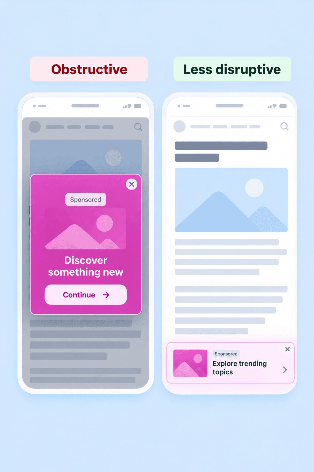
An ad that follows readers around the screen certainly knows how to get attention. Whether it's the kind of attention you want is another question.
Avoid placements that obscure essential content, interfere with navigation or make dismissal difficult. Some overlay and sticky formats may be acceptable under the applicable Better Ads Standards, depending on their size, behavior and device.
Evaluate the specific experience before using it. Even a format that meets the standards can frustrate your particular audience.
4. Protect Audience Trust
A native ad should look at home on your website. It shouldn't need a disguise.
Make sponsored recommendations clearly identifiable, especially when they appear alongside editorial articles or content cards. Readers should understand what they're clicking before they click.
The same care applies to ad quality. Misleading claims, shocking imagery or irrelevant promotions can damage the experience regardless of where the ad appears.
How to Test Website Ad Placements
So, you've found a promising spot for an ad. Time to put it to work?
A promising ad placement is still just a hypothesis until real visitors get involved. And they have a habit of behaving differently from what a neat website mockup suggests.
More impressions might look like progress while reading completion quietly takes a hit. Here's how to test a placement before giving it a permanent home on your page.
1. Start With One Clear Hypothesis
Pick a specific page type, placement and expected outcome.
For example: Adding one native ad between major sections of a long-form guide will increase revenue per session without significantly reducing reading completion.
That's something you can actually test. "Let's add more ads and see what happens" is more of a gamble.
2. Compare Two Layouts
Keep your existing layout as the control (A) and test the proposed placement in version B.
Change one major placement decision at a time. If you add three units, move the sidebar and introduce a sticky ad simultaneously, good luck figuring out which change caused the result.
Compare similar audiences, devices and page types. Where possible, randomly assign visitors to versions A and B to reduce the risk that traffic differences influence the results.
3. Decide What Success Looks Like
Revenue matters, of course, but it shouldn't get the only vote.
Track three groups of metrics:
- Monetization: Page RPM and revenue per session show how effectively the layout generates advertising income.
- Reading behavior: Scroll depth and reading completion help reveal whether visitors continue engaging with the content.
- Audience retention: Return visits can indicate whether the experience affects readers' willingness to come back.
You can also inspect ad viewability to understand whether the new placement is actually being seen.
Choose your primary success metric and acceptable limits for reader-impact metrics before the test starts. Otherwise, you risk cherry-picking a flattering number and calling the test a success.
4. Give the Test a Fair Chance
Don't judge a new placement after one unusually good afternoon. Run the test long enough to collect a meaningful sample across normal traffic patterns. Consider differences between weekdays and weekends, mobile and desktop visitors and major traffic sources.
The right duration depends on your traffic volume and the size of the effect you're trying to detect. A small website may need considerably longer than a high-traffic publisher.
If the new layout causes an obvious usability problem, there's no prize for keeping the test running.
5. Look at the Whole Result
Once the test ends, compare the results against the success criteria you set at the start. Look for meaningful changes, check whether the trade-offs are acceptable and resist the temptation to celebrate one impressive metric. Sometimes the numbers tell a very different story once you put them side by side.
How to Interpret Your Ad Placement Test Results
The test is over, and version B has a 15% higher page RPM. Looks like a win, right? Well, there's a little more to the story.
Imagine a publisher testing an additional in-content ad on long-form articles. Version A keeps the original layout, while version B introduces one extra ad between sections.
Here's what the results might look like.
| Metric | Layout A (Control) | Layout B (Extra ad) |
|---|---|---|
| Page RPM | $8.00 | $9.20 |
| Revenue per session | $0.012 | $0.011 |
| Pages per session | 1.50 | 1.20 |
| Reading completion | 64% | 55% |
| 7-day return rate | 21% | 18% |
That 15% increase in page RPM looks promising. But the rest of the table tells a less flattering story.
Visitors view fewer pages per session, which helps explain why revenue per session has fallen despite the higher page RPM. Reading completion is down nine percentage points, and the 7-day return rate has dropped by three percentage points.
The extra ad may be earning more per pageview while the overall session becomes less valuable. These numbers alone don't prove the placement caused the declines, but they give the publisher plenty of reasons to investigate before rolling it out.
Page RPM vs. Revenue per Session: What's the Difference?
These two metrics answer different questions.
Page RPM estimates advertising revenue for every 1,000 pageviews.
Unlike CPM, which measures advertising costs per 1,000 impressions, page RPM reflects publisher revenue per 1,000 pageviews — a distinction that matters when comparing placement performance.
Revenue per session measures how much advertising revenue the website earns, on average, from an entire visit.
A visitor might view several pages during one session. If a new placement increases revenue on the first page but discourages further browsing, page RPM could rise while revenue per session falls. That's why both metrics deserve a place in your test report.
What Should the Publisher Do With These Results?
Version B isn't ready for a full rollout just yet. The publisher could move the extra ad, reduce its size or return to the original layout. Another test might reveal whether there's a way to keep the revenue opportunity without the same drop in reading completion.
And if the trade-off still doesn't work? Sometimes the smartest optimization is removing an ad.
When to Keep, Revise or Remove an Ad Placement
The numbers are in. Now comes the part that actually changes your website: deciding what to do with them.
Every tested placement has three possible outcomes.
| Decision | When it makes sense | What to do next |
|---|---|---|
| Keep | Revenue meets the test target, and key reader-experience metrics remain within acceptable limits | Retain the placement and continue monitoring |
| Revise | Revenue potential is promising, but viewability, reading behavior or other guardrails raise concerns | Test a different position, size or format |
| Remove | The placement consistently underperforms, causes unacceptable disruption or fails to meet your success criteria | Remove the unit or restore the previous layout |
Don't be afraid to retire a placement that isn't pulling its weight. Every ad occupies space that could serve your content, your readers or another advertising opportunity.
Once you've identified the placements worth keeping, you can turn your attention to the commercial side. Our guide to selling ads online explores how to package and monetize your available inventory.
Conclusion
There's no magic spot on a webpage where every ad suddenly performs better. Readers scroll differently, pages serve different purposes and even a promising placement can disappoint.
Start with a sensible layout, test it against real reader behavior and be willing to change what isn't working. Sometimes that means moving an ad. Sometimes it means giving the space back to your content.
After all, your website has a job to do beyond displaying ads. Make sure it still does that job well.