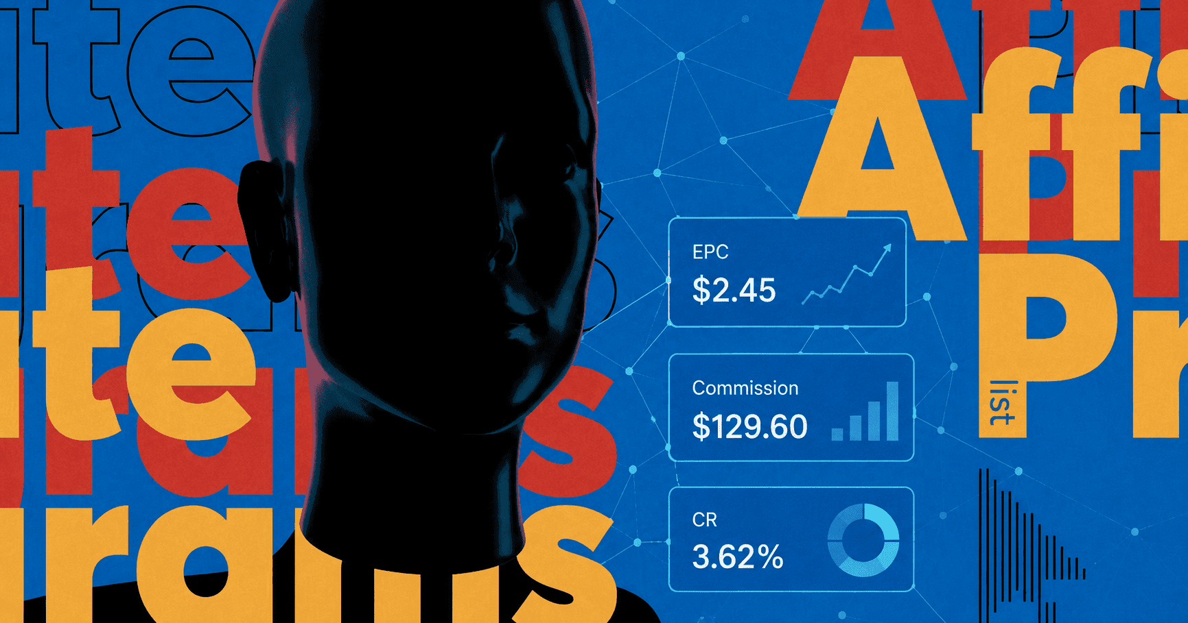
Designing landing pages that convert has always been about staying one step ahead of the competition and outdoing them in any way possible. New design strategies give landing pages a fresh look and show an aptitude for innovation that users can appreciate.
Of course, there are certain “best practices” that carry over year after year. There’s no need to reinvent the wheel every time you launch a new campaign, but knowing how to enrich an already perfect landing page is certainly going to get you more clicks. Here are a couple of new hacks to design excellent landing pages in 2022.
Landing pages have one goal
Landing pages have a clear-cut mission and a fairly straightforward goal to achieve. They need to convert, and to do that, they need to be hyper-focused on the campaign, its goals, and its targets.
For that reason, landing pages are not the right place to go wild with different styles or designs. Rather, everything on that page should work towards the same goal without distracting the user with unnecessary and pointless messages or flashy designs.
Simplicity is usually the name of the game, but that doesn’t mean you shouldn’t get creative. It’s alright to try new designs and ideas so long as the core message of the campaign remains clear throughout the page.
Best trendy landing page designs
By carefully observing user trends and the evolution of landing pages, we were able to determine what the next great design tactics will be.
Horizontal scrolling
We’re all too used to how pages work and already expect to see certain behaviors even before the landing page is loaded. One example that feels all too natural is the vertical scrolling that most of the internet relies on.
That doesn’t have to be the case, however, Certain websites have already explored the idea of horizontal scrolling, and have determined some of the dos and don’ts of such an approach. For example, users haven’t been very receptive to horizontal scrolling when it led to too much content. They felt it broke the natural flow of the page, negatively impacting their UX and blocking them from getting where they wanted to go.
Landing pages are different. There isn’t going to be an excess of content and links on these pages. If there is, you are doing something wrong. It’s the perfect place to integrate horizontal scrolling, showing a carousel of images that all reinforce the main message of the ad campaign and showing the user benefits of converting.

In the landing page sample above, horizontal scrolling takes you on a deceptively simple, yet beautiful journey of the concept that ends just as a landing page should - with the ability to convert. It’s the perfect example of how unique and engaging horizontal scrolling is.
Illustrations vs photographs
We’ve all seen landing pages with photographs of people or places that support the core message of the ad campaign. But do they really?
More often than not, these photographs are completely out of place, showing generic situations and emotions that we’re all too tired of seeing. Slapping generic photographs on all your landing pages can amount to something akin to banner blindness - visitors will ignore these photos; they’ve seen them a million times already. That’s terrible for your campaign, as the landing page should have no elements that feel redundant or useless.
One way that landing page designers have decided to tackle this problem of overabundance of meaningless photos is to use illustrations instead. Unique and creative illustrations really draw the user’s attention. They give the page a stylized look and feel that’s more likely to inspire the user to take an action, and well, that’s what landing pages are for.

It’s also possible to use branded illustrations on your landing pages, i.e., an illustration style that is specific to your brand and makes it recognizable.
Animated GIFs
Static images may no longer be what it takes to captivate your audience, not when all your competitors are slowly adopting a more dynamic design approach to landing pages.
Not every element of your page needs to be in motion. There is such a thing as an excess of animation that will draw your users’ attention away from the action you want them to take. However, if you’re careful and deliberate in your placement of animations around the landing page, you’ll be able to achieve your goals without distracting the users.
To avoid losing conversions, you could rely on either animated GIFs or micro animations. Both can enrich your landing page experience without overstimulating the users. Micro animations can be used to accentuate the specific part of the page you want to draw your users’ attention to, such as the CTA button. GIFs can be used to the same extent and earn you the appreciation (and the conversion) of a large client base.

Videos on landing pages
Video is by far one of the most popular mediums to tell your brand's or product’s story. Users love the content in video form - it’s easy to consume and requires little of their time. The landing page is not the place for overly long videos that never get to the point.

Thank you page
Once the user is wowed by your landing page and decides to take action, it’s only appropriate to show your appreciation for them. Thank you pages aren’t exactly a new trend, but they’re still rare enough that using one will help you stand out. It’s the page that you show your leads once they’ve submitted a form or taken any other action. These pages are perfect opportunities to nurture your leads and further develop your relationship with them.

Conclusion
There are definitely new design strategies on the horizon and ones that will make your landing pages truly stand out. It’s time to innovate and reinforce your campaigns with incredible landing pages that will captivate and convert like never before.