
In the past several years, we have seen time and time again that personalizing the user experience is key to driving more traffic and retaining existing users. Conveying a message in a relatable and unobtrusive manner is always a reliable approach to gaining favors with your customers.
As they say — you know when your UX is working when there’s nothing to see. UX personalization should be seamless. If there’s something sticking out, working improperly or breaking the immersive experience, then the UX designer has failed.
In the case of websites and digital marketing, UX personalization and automation go hand in hand. Marketers often rely on software solutions to personalize marketing campaigns on a large scale. As you may expect, the results aren’t always great, especially when automation has been carried out superficially and without real world complexities in mind.
Today, we’ll show you the best and worst of UX personalization efforts.
The Best of UX
DoorDash - Personalized for Dashers
DoorDash’s landing page emphasizes the potential for making a living as a Dasher. Instead of targeting hungry DoorDash users, the landing page focuses on prospective delivery drivers and entices them by highlighting their potential weekly earnings.
With earnings reports at the forefront of its page, it is quite obvious that the UX is focusing on signing up new delivery personnel and emphasizing not only a Dasher’s financial freedom but also their freedom to work whenever they please.

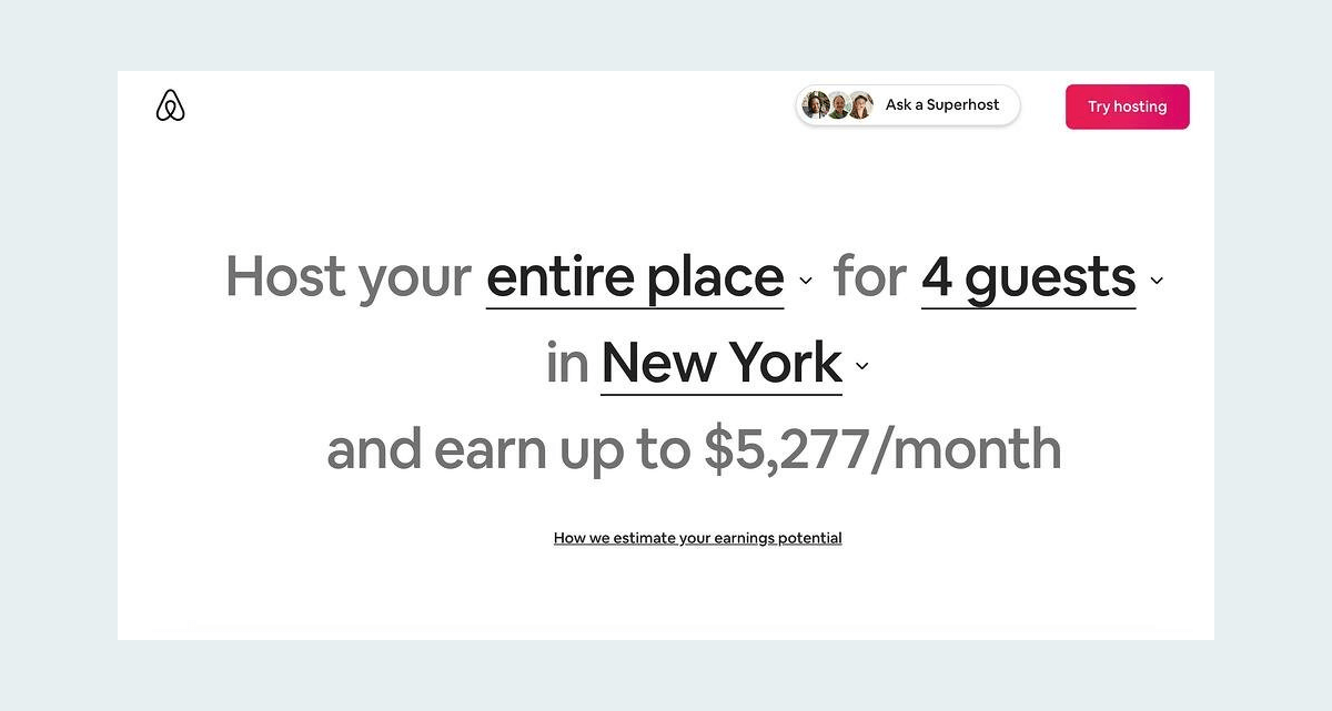
Airbnb - Personalized for Hosts
In recent years, vacation rentals have become one of the new, enticing earning opportunities, with Airbnb at the forefront. For those who have thought about hosting, Airbnb shows users exactly how much they’d earn by simply visiting the Airbnb website and entering their location.
By allowing users to see potential earnings as a host, based on their location and the type of accommodation they would be offering, Airbnb has taken the UX to a whole new level. They know that most people who visit their site are interested in the prospect of becoming an Airbnb host, so they give users a little nudge in the right direction.
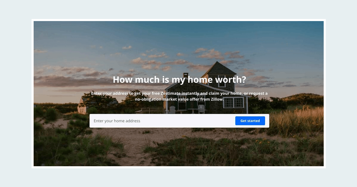
Zillow - Seller’s UX
Selling a home is no easy feat. It’s a stressful life event that most people just want to get over with. Part of the selling journey is finding out how much your home is worth and how much you can really get for selling.
Zillow takes that difficult journey and packages it into a smooth UX. The easy-to-navigate website only requires the home address to get started. Once that information is provided, all that’s left is to see the home estimate and how much money you can get, including remaining mortgage payments and other important bits of information that will help in the decision making process.
Sezzle - Multiple CTAs
When you think about it, using only one CTA to capture every segment of your audience is not conducive. Not everyone is at the same stage of their customer journey, so a one-size-fits-all solution to reach your entire user base does not work.
Sezzle realized this and put in place multiple CTAs for a better UX of different user groups, empowering everyone, from the average user to someone hellbent on purchasing.

Spendesk - Social Proof Personalization
Spendesk took personalization to a completely different place. By showing visitors testimonials from people in their industry, they personalized one of the most trustworthy elements of the page — the social proof.

The Worst of UX
Adidas - Lack of Awareness
Poor wording and a lack of awareness regarding real-life tragic events turned Adidas’s attempt at personalization into a PR nightmare.
It’s a perfect example of how a seemingly benign congratulatory message can be misconstrued and cause offense.

Jack in the Box - First Name “Personalization”
The infamous “Fname” problem. If your entire UX personalization efforts revolve around pulling your customers’ first name and inserting it into all your messaging, then we suggest having a safeguard in place for users who didn’t provide their name.
Even with such a safeguard in place, it’s still one of the most worn-out personalization methods out there. Get creative, instead!

Amazon - Sensitive Issues
It seems like a cute idea to personalize a purchase of baby products by telling you that “a gift is on its way,” intentionally making it appear that the baby is the gift that will be arriving.
Backlash showed Amazon that people were not too happy about this, especially when this automated email was sent to users who had never signed up for an Amazon baby registry and, unfortunately, included couples who couldn’t conceive and people who had already given up on the prospect of having children. Having children can be a sensitive issue for some, so be aware of such sensitivities.

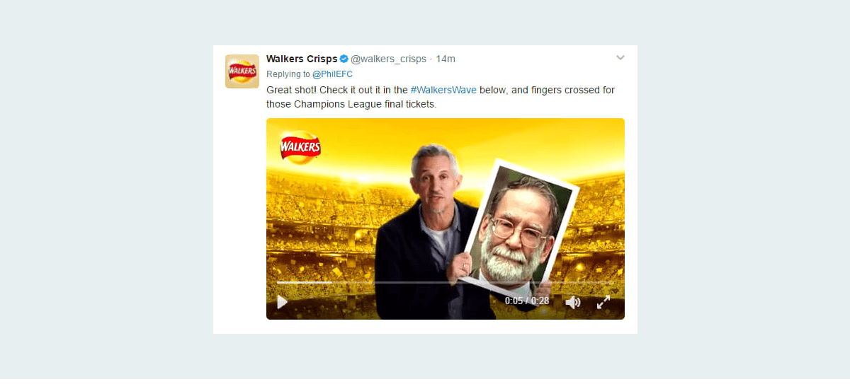
Walkers Crisps - Giveaway Personalization Fail
If there’s one rule that all brands should abide by on the internet, it is not to run public campaigns and polls without heavy moderation. Walker Crisps thought it would be an amazing idea to give away Championship League final tickets to people who sent in their photos.
Little did they know that the internet denizens are not to be trusted, so they ended up promoting photos of Harold Shipman, one of the most prolific serial killers of the modern era.
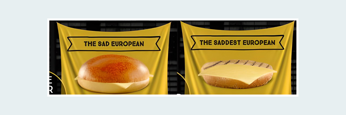
McDonald’s - Product Personalization Fail
Similar to Walker Crisps, McDonald’s thought it would be an awesome idea to let users build their own burgers.
Without moderation teams checking every user creation, the restaurant’s website was soon flooded with burgers with the most offensive names, ludicrous ingredients and downright disgusting appearances.
Bottom Line
UX personalization is a complex process, but one that yields incredible results when done right. All of the best personalization efforts we listed in this article take the customers’ needs in mind and give them exactly what they want. The worst ones, on the other hand, are all products of thoughtless automation and naivety.
Think about your customers, analyze their data and be mindful of your personalization efforts, and your UX might just be featured in someone else’s list of best website personalizations.


